1. Introduction
Checkmk’s graphical user interface (GUI) has two functions:
It displays the current status of all hosts, services and events in the monitoring environment.
It is used in the configuration environment to setup and to manage the monitoring environment.
For both of these functions Checkmk provides two views of the hosts and services — and also two menus for getting started with both functions: the Monitor and the Setup menus.
In this article, we will look at all of the elements you see in the image of the Checkmk user interface above — working our way through the Checkmk user interface from left to right: from the navigation bar to the main page to the sidebar. Only the most important items in the navigation bar will be presented in separate sections, starting with the three menus you’ll likely use most often.
 |
The visible menus and menu entries on the navigation bar depend on your permissions. If you cannot see individual menus or menu entries in your Checkmk, you do not have the corresponding user permissions. |
2. The Navigation bar
With the navigation bar on the left and the icons it contains, you make the basic decisions about what Checkmk should do for you:

The Checkmk logo — for displaying the start page.
Search — for the search.
Monitor — for the monitoring itself.
Customize — for the customization of interface elements useful for the monitoring such as bookmarks, views, dashboards, and graphs.
Setup — for setting up the objects to be monitored (such as hosts and services).
Behind these three icons Monitor, Customize, and Setup are more or less extensive menus, the so-called 'mega menus' or icon menus, whose entries are divided into several topics — for example, in the Setup menu under the Hosts topic you will find entries for configuring hosts, host groups, host tags and host-specific rules.
Changes — for activating pending changes.
If there are pending changes, their number will be displayed in yellow in the Changes icon.
Help — for displaying helpful information.
At the top right of the Help menu, you will find the edition and version of Checkmk currently in use.
The menu itself contains entries with which you can call up documentation and information — inside Checkmk or outside.
Among other things, you can also open this User Guide.
If there are incompatible changes after an update of the site, you will see the number in red background color in the Help menu icon.
In the Help menu itself, a link in red background color is then displayed with which you can open the list of Werks of these incompatible changes.
User — for changing your user account.
At the top right of the menu you will see the current username and the role assigned to this user.
In this menu you can personalize your profile and log out of the Checkmk interface.
An overview of the available personal settings can be found in the chapter on the User menu.
Sidebar — for showing and hiding the sidebar.
Keyboard shortcuts
For quick navigation in the icon menus, various keyboard shortcuts are available.
| Shortcut | Action |
|---|---|
Strg+K |
Opens the search. |
Alt+M |
Opens the Monitor menu. |
Alt+C |
Opens the Customize menu. |
Alt+S |
Opens the Setup menu. |
Esc |
Closes the open menu. |
Tab |
Next hit in the search results. |
Shift+Tab |
Previous hit in the search results. |
Enter |
Call up search hit. |
|
In the Checkmk GUI, JavaScript evaluates the number assigned to a key (keycode) and not the symbolic name derived from it (keysym). The keys shown in the table therefore refer to the QWERTZ keyboard layout. If you are working with a different layout (for example, AZERTY in the French-speaking parts of Switzerland), you may need to use other keys. |
2.1. Monitor menu
Your basic toolbox for completing all monitoring tasks is the Monitor menu, which you can open via the navigation bar:
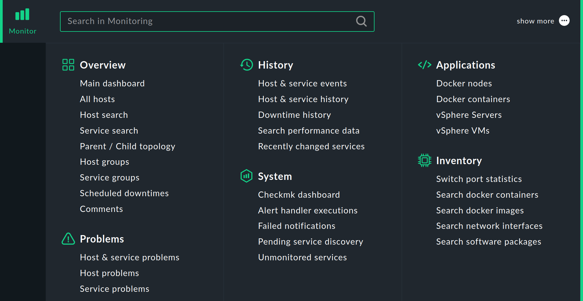
In this menu you will find the tools that will provide you with answers to your monitoring questions. The menu is subdivided according to topics. You will find the menu items listed below each topic.
After selecting one of the entries in the Monitor menu, the requested information is usually displayed on the main page either as a dashboard or as a view — each of which we will cover in more detail in this article.
|
You can also load the contents of the Monitor menu into the sidebar — as a snap-in with the title Views.
This snap-in is not included in the sidebar by default.
But you can simply add it to the sidebar by clicking |
2.2. Customize menu
You can customize and extend elements of the graphical user interface that are useful for monitoring in the Customize menu:
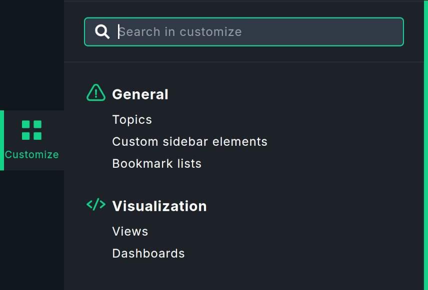
Here you have access to, among other things bookmarks, views, dashboards, — and in the commercial editions additionally to graphs, forecast graphs, reports and extended availabilities (SLA).
When you call up one of the menu items, a list of currently existing objects is displayed. In some lists you will find built-in objects delivered with Checkmk that you can edit or use as templates for your own objects.
2.3. Setup menu
Your entry point to the configuration of Checkmk is the Setup menu, which you can open via the navigation bar:
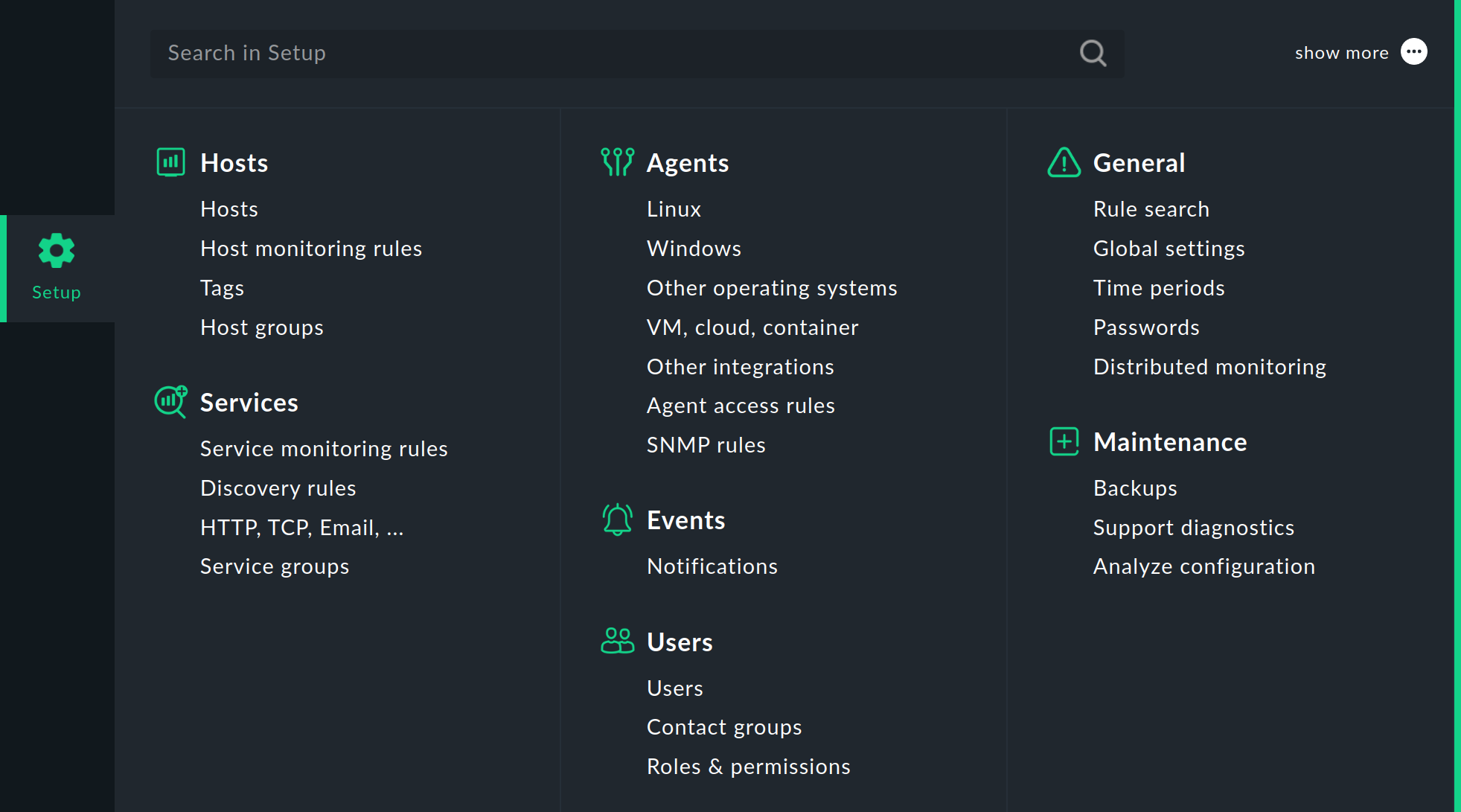
In this menu you will find the tools with which you can set up and configure Checkmk. The menu is divided into topics. Below each topic you will find the menu entries. For Hosts, Services and Agents you get access to different categories of rule sets. The concept of rule-based configuration is central to Checkmk and very powerful.
|
You can also load the contents of the Setup menu into the sidebar with the Setup shortcuts snap-in. |
2.4. Searching
The Checkmk interface has a central location for global searches: the Search icon in the navigation bar. When you click on Search, the input field for your search terms will be displayed, along with a few other elements to help you with your search:
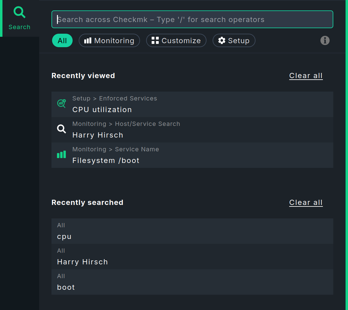
Before you start searching, i.e. when the input field is empty, two lists show details of your last five searches. Of course, this only applies if you have already searched a few times and have not deleted your search history with Clear all. Recently viewed shows which pages were last opened from the search, and Recently searched shows the search terms entered. You can click on any of the entries in the list to open the corresponding page immediately or to transfer the search term to the input field.
The fastest way to start is to type a search term into the input field. You can use any keywords you like when entering your search. You do not need to worry about upper and lower case letters. When you finish your entry by pressing the Enter key, the search will close and on the main page Checkmk will display all matching hosts or services in the monitoring.
Starting the search quickly is not always the best way to achieve the desired result — for example, if you are not searching for the name of a host or service, rather instead for a specific rule or global setting. Hosts and services are found in the monitoring environment, rules and global settings in the configuration environment. It is fortunate, then, that Checkmk searches in multiple environments.
As soon as you start typing your search term, you will immediately see the results below the search field, along with the areas in which they were found:
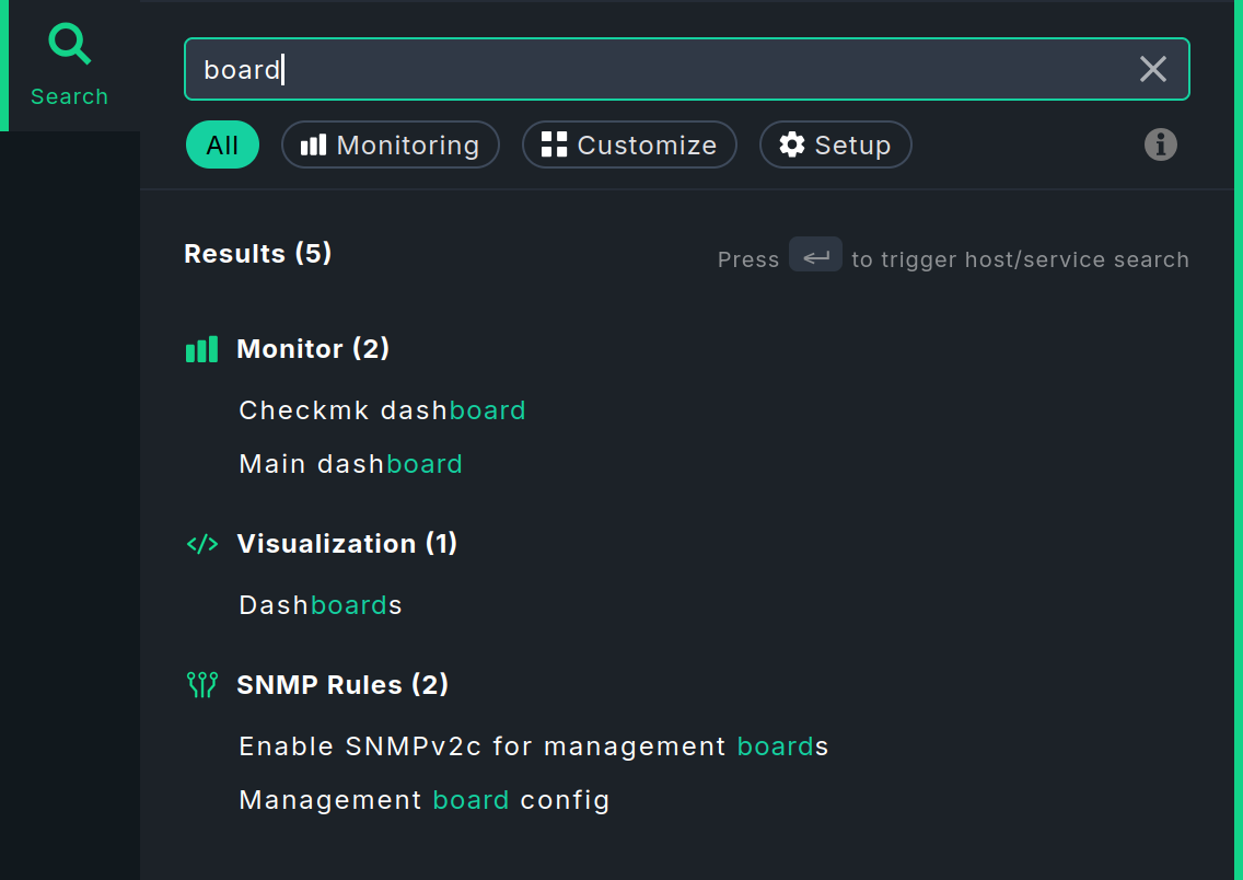
Grouping improves the overview, especially when there are a large number of results. Initially, only a maximum of five results are displayed per group. You can then reload the rest using the last entry Show all. The results are usually grouped according to the topics under which they can be found in the icon menus of the navigation bar.
Checkmk searches in the Monitor, Setup, and Customize menus of the navigation bar. Below the input field, you have the option of restricting the scope of the search. This is particularly useful if you already know in which area you expect to find the result, for example, a service in Monitoring or a rule in Setup.
With All, the search is performed in all three areas. This is the default setting when you start the search using the Search icon. However, you also have the option of starting the search in the Monitor, Setup, or Customize menu using the input field that appears at the top after opening the menu. After entering the first character, you will be redirected to the global search. The search area will be limited to the menu from which you started the search.
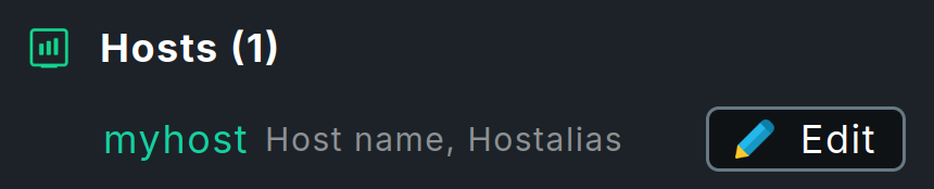
In the search results, a line containing a host name sometimes also contains the  Edit button, which allows you to directly open and edit the properties of this host.
The results of the search in the configuration environment and monitoring environment are combined here.
Therefore, this button is only displayed if you have searched in the All area and the host exists in both the configuration environment and the monitoring environment.
Edit button, which allows you to directly open and edit the properties of this host.
The results of the search in the configuration environment and monitoring environment are combined here.
Therefore, this button is only displayed if you have searched in the All area and the host exists in both the configuration environment and the monitoring environment.
Checkmk performs the search in the background using various methods, collects the results, and presents them in a uniform manner in the global search. The specific features used in searching the individual menus are explained in the following sections.
Searching in the Monitor menu
The Monitor menu (in the monitoring environment) searches for hosts, services, and entries within the menu itself. The search is performed using Livestatus queries.
In addition to the free-text search, there are several special search operators (filters) available for searching in the Monitor menu.
You can use these to search specifically for particular host names, service names, service statuses, and other items.
The filters available to you are displayed in two ways during the search, provided you have selected the search area All or Monitoring.
Enter a slash (/) in the empty input field or click the  icon to the right below the search field.
The list of available filters will be displayed:
icon to the right below the search field.
The list of available filters will be displayed:
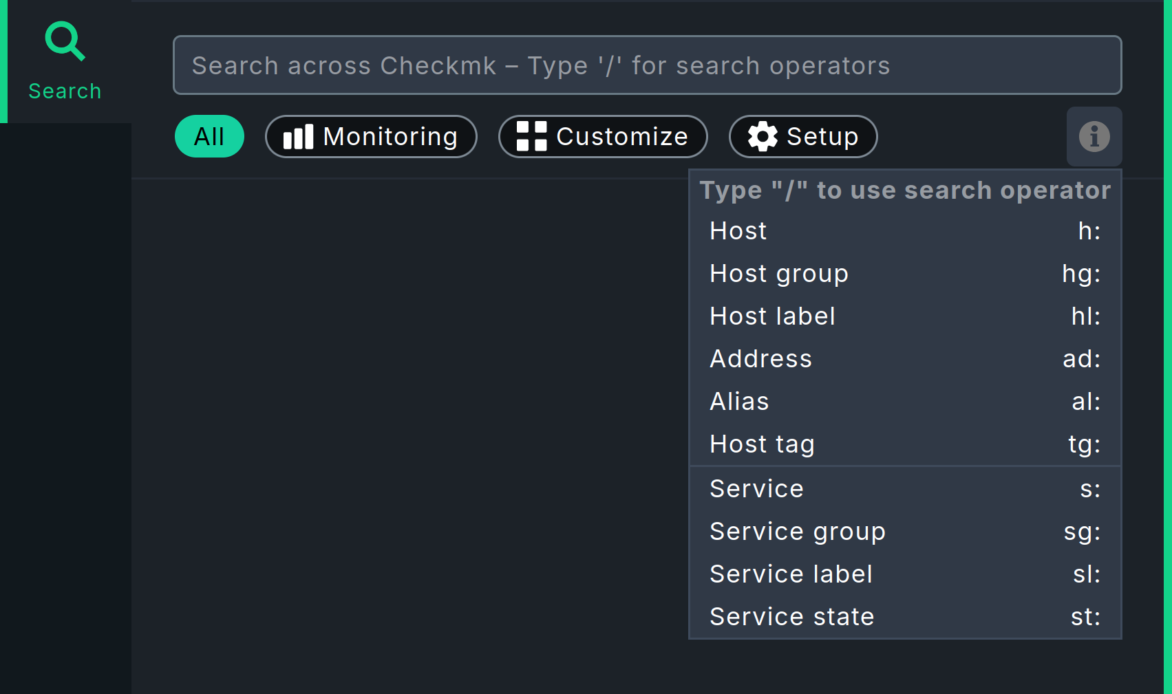
For example, you can search for patterns of host names (using h:), patterns of service names (using s:), and you can combine both.
A search for s:boot shows you all services containing boot, and a search for h:win s:cpu shows you all services containing cpu on hosts that themselves contain win.
You can also use filters multiple times and in combination.
Multiple instances of a filter are linked with OR, while different filters are linked with AND.
Exception: Multiple host tag filters (tg:) are always linked with AND.
For example, a search for st:warn st:crit returns all services in the WARN or CRIT state (you can find the other possible states using the predefined values ok, unkn, pend).
These search operators, when used in combination with regular expressions, allow you to create precise, complex filters, such as:
h: ^my.*Host$ s: ^my.*(\d|test)$ tg: mytag tg: mytest
This will find:
Services that start with my and end with a digit or test, run on hosts that start with my and end with Host, and finally have the two host tags mytag and mytest.
You can use regular expressions for every single filter — with the following exceptions:
Regular expressions are not allowed for host and service labels; that is, the label must be entered exactly as it appears in the key:value syntax, e.g., os:windows.
As soon as you set group or host tag filters in addition to filters for name, address, or alias, the former must be specified explicitly, for example, hg: Webserver s: apache.
What does not work: hg: Web.* s: apache.
Background: The different filters access different sources with different data structures and functions.
Of course, you can search for specific host groups using a pattern (hg: .*server) and then use the result in the original search.
If you do not set any filters when searching, the system will first search the entries in the Monitor menu by default, and then sequentially through the filters for host name, host alias, host address, and service name — in that order. You can customize the filters and their order under Setup > General > Global settings > User interface > Quicksearch search order.
By default, a search query in the monitoring environment returns a maximum of 80 results. However, you can change this value under Setup > General > Global settings > User interface > Number of elements to show in Quicksearch.
If you are wondering why the two global settings mentioned have such unusual names: The search function in the Monitor menu is identical to the one provided by the Quicksearch snap-in — and this snap-in was available in Checkmk even before the menu.
To conclude this section, here is a brief digression for those interested in what happens behind the scenes at Checkmk when a search query is made in the monitoring environment.
Each search query generates a Livestatus query. You can see which one this is in the Checkmk GUI by enabling the global setting Setup > General > Global settings > User interface > Debug livestatus queries.
If you enter your search term for the Monitor menu and submit it with Enter, you will receive a table view listing the hosts/services that match your search. If the Debug livestatus queries setting is enabled, the Livestatus query resulting from your search query will be displayed at the bottom of this results page. As a site user, you can also use this and similar queries on the command line.
For example, entering h: localhost s: mem s: cpu h: switch-intern for the search in the Monitor menu looks something like this as a Livestatus query on the command line:
How to work with Livestatus on the command line is described in the Livestatus article.
Here is a brief description of the above example:
Start the interactive input stream with the command lq.
Then enter the Livestatus query in the following blank line, as displayed by the debug mode of the Livestatus queries in the Checkmk GUI: in the example, these are the following four lines.
For better readability, we have limited the Columns to the two columns that are also used by the following two filter lines.
Complete the entry by pressing the Enter key twice.
The blank line is then followed by the five lines of output as the result.
Searching in the Customize menu
In the Customize menu, the search is limited to entries within the menu itself. It does not include entries on pages that can be accessed via the menu.
Searching in the Setup menu
Using the search function in the Setup menu, you can search the Checkmk configuration environment — that is, the Setup menu itself, including all of its visible entries as well as some hidden ones. The search scope includes, among other things, all rule sets that are grouped into topics in the menu, and the Global settings. The search is performed in the titles and parameter names. The search is performed using Redis, an in-memory database that runs in the Checkmk site as site service.
2.5. User menu
In the User menu you can change personal settings that are valid for your user account:
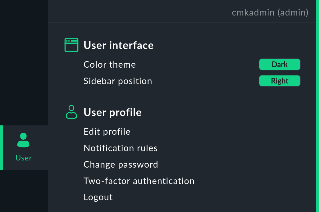
Frequently-used settings can be toggled by clicking directly in the User menu (User interface), some by calling up a specific page, e.g. to display the notification rules. Most settings, however, can be accessed and changed centrally via the Edit profile page.
| Setting | Note |
|---|---|
Color theme or User interface theme |
Switching between Dark and Light themes is possible directly in the User menu. |
Sidebar position |
Here, too, you can switch between Right and Left directly in the User menu. |
Received messages |
Displays a page with the messages addressed to your username. |
Language of the user interface |
You can choose between the languages officially supported by Checkmk, German and English. In addition, the languages translated by our community are offered for selection, but these are not officially supported and are therefore marked with (not supported). |
Temperature unit |
You can choose between Celsius and Fahrenheit for display in graphs and Perf-O-Meters. |
Visibility of hosts/services |
Show all hosts and services, or only those to which you are assigned as a contact. |
Disable notifications |
Switch off all notifications for a selectable period of time. |
Start URL to display in main frame |
Set the start page.
There are menu entries for two special pages:
Default start URL for the default dashboard and Welcome page for the welcome page.
With the Custom start URL entry, you can also make any other Checkmk page the start page.
Open the desired page (for example, Monitor > Overview > All hosts) and determine the entry for the input field from the URL displayed in the browser (for example, |
Navigation bar icons |
Show icons with title, or only icons. |
Default behavior for 'Changes' |
The Changes icon in the navigation bar shows either the slideout with the most important information or the full view with all information. |
Mega menu icons |
Show (green) icons by the topic or (colored) icons by each menu item. |
Show more / Show less |
By default show less or show more or always show all. |
Contextual help icon |
Show or hide the |
Notification rules |
Rules for user-defined notifications. |
Change password |
You must enter the existing password once and the new password twice. Password requirements for local accounts can be set globally: Setup > General > Global settings > Password policy for local accounts |
Two-factor authentication |
Activation of increased security through two-factor authentication. |
Logout |
Possible only directly in the User menu |
|
For some settings there are default values that can be changed globally for all users via Setup > General > Global settings, mostly under the User Interface topic. In addition, the role with its permissions assigned to your user account determines whether certain settings are visible and can be changed. |
3. Main page
The main page is the area between the navigation bar on the left and the sidebar on the right. After logging in, you will see the start page there. What you see on the main page depends on where you are currently navigating in Checkmk. The content of the main page changes depending on your selection in the navigation bar or the sidebar. For example, in the Monitor menu, you can select Hosts > All hosts:
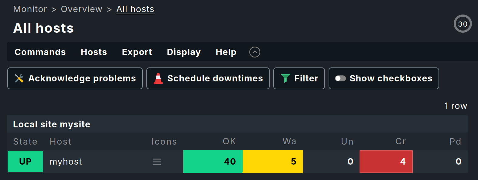
Regardless of which page is currently displayed, you will usually find the following elements on the main page:
'Breadcrumb' path: Above the page title you see the path to the current page — always starting with the name of the menu from the navigation bar. These breadcrumbs prevent you from getting lost in the user interface. This way you know where you are in Checkmk even after complex actions — in this example, on the All hosts page in the monitoring.
Menu bar: Below the breadcrumb path, the menu bar is displayed, which summarizes the possible actions on this page in menus and menu entries. The menus are always context-specific in Checkmk, i.e. you only find menu entries for actions applicable to the current page.
Inline help: You can use the Help menu to show context-sensitive help texts on the current page with Help > Show inline help, which is very helpful on pages that contain many parameters. The selected mode also remains active for other pages that you call up until you deactivate it again.
Action bar: Below the menu bar you will find the action bar, in which the most important actions from the menus are offered as buttons for direct clicking. You can hide the action bar with the
 button to the right of the Help menu and show it again with
  .
When the action bar is hidden, icons for the hidden buttons are added to the right of the Help menu.
.
When the action bar is hidden, icons for the hidden buttons are added to the right of the Help menu.Countdown for page update: In the monitoring environment, the update interval for the page is displayed in seconds at the top right of the page and the remaining time to the next update is visualized on the surrounding circle line.
By the way, you can change the refresh interval in the menu Display > Modify display options.
After selecting one of the entries in the Monitor menu, the main page will usually show you the requested information either as a dashboard or as a view, which we will discuss in more detail in the following sections.
3.1. Dashboards
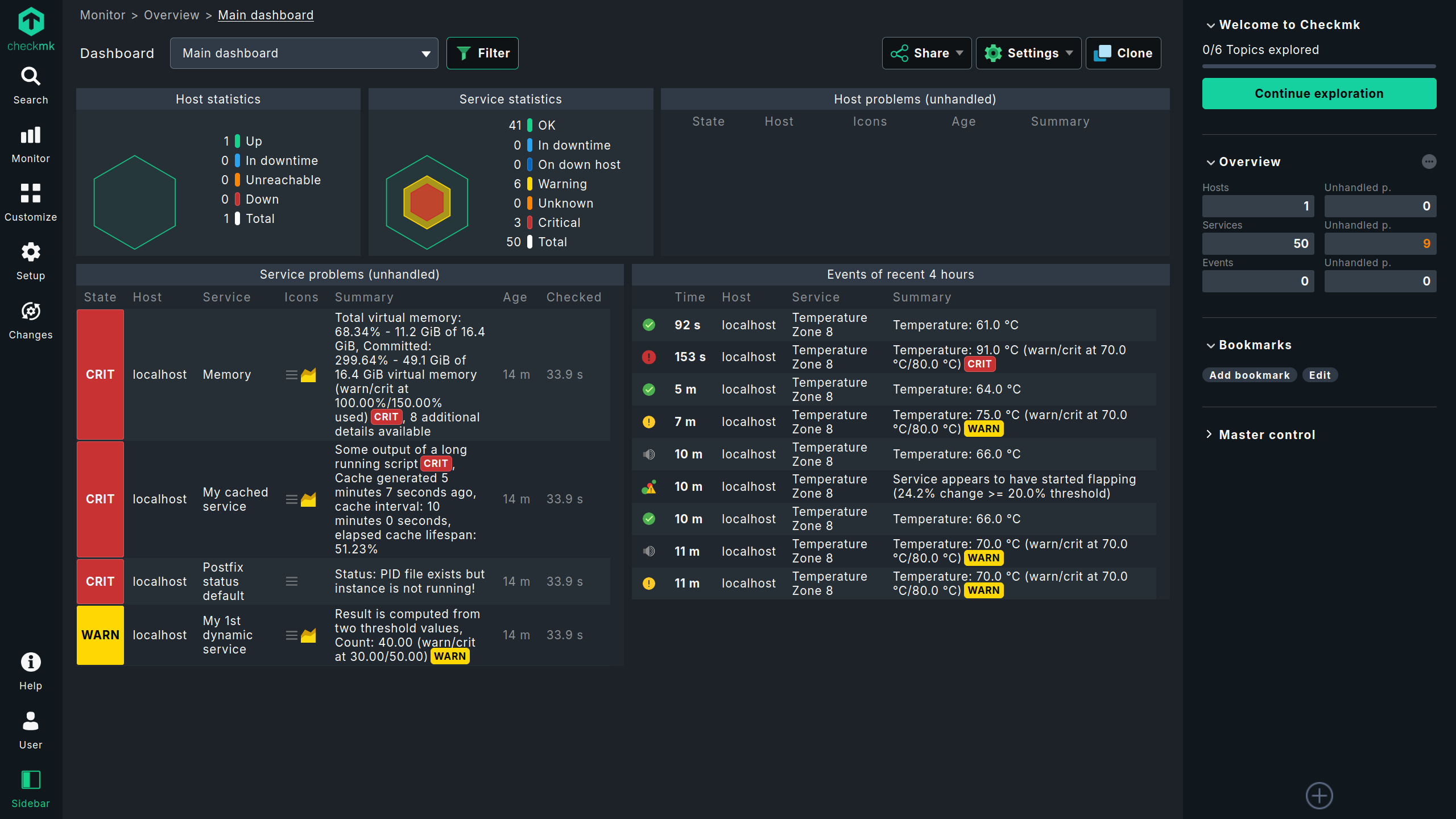
A dashboard presents the most important information on a topic on a single page, such as the answer to the question "What host and service problems are there in my Checkmk site?" Different visualizations of data are used and combined in a dashboard, such as views, history graphs, tables, diagrams and many other elements. The aim is to present the information from different perspectives to you in such a way that you can grasp the essentials quickly and are not distracted by unnecessary details.
Checkmk provides several preconfigured dashboards that you can open from the Monitor menu: the Main, the Checkmk and (only in the commercial editions) the Problem dashboard.
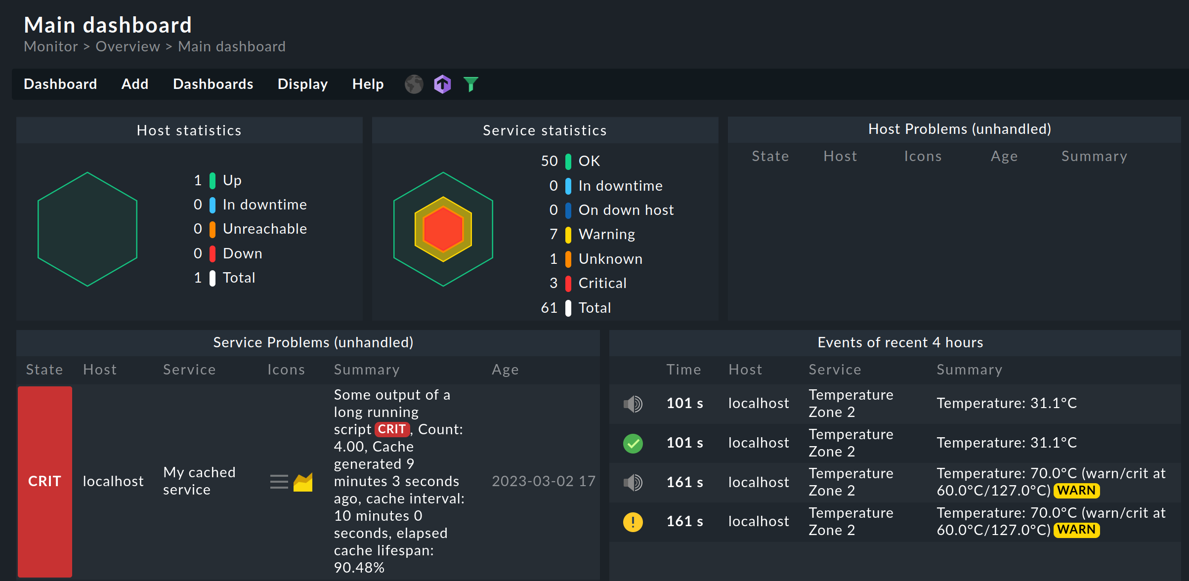
 The Main dashboard in Checkmk Community shown above, which displays problems and statistics for all hosts and services, is replaced in the commercial editions by a different dashboard that includes graphs.
The Main dashboard of Checkmk Community is called Problem dashboard in the commercial editions.
The Main dashboard in Checkmk Community shown above, which displays problems and statistics for all hosts and services, is replaced in the commercial editions by a different dashboard that includes graphs.
The Main dashboard of Checkmk Community is called Problem dashboard in the commercial editions.
If one of these dashboards is displayed, you can quickly switch to another one: in the Dashboard menu below the breadcrumb path, you will find the entries for the available dashboards. You can also move the currently displayed dashboard to the start page: in the Settings > Set as start URL menu.
The Checkmk dashboards in anchored layout automatically adapt to the screen dimensions using an intelligent algorithm, thus making optimal use of the screen size. In the alternative responsive layout , available in the commercial editions, you can easily design the layout using drag-and-drop; the layout will then automatically adapt to different screen sizes. You can also use the individual parts of a dashboard, known as widgets, to customize existing dashboards and create new ones. For more details, see the article on dashboards.
3.2. Views
A view offers access in monitoring to various displays of hosts, services or other objects under a certain perspective as a table. Such a view can have a context — for example, if it shows all the services running on a certain host. Other views work globally — for example, the view that shows you all the services that currently have a problem.
All the global views can be opened from the Monitor menu, below the respective topic, for instance All hosts, Service problems or Failed notifications. After clicking on one of these menu items, the corresponding view is displayed in the main page — in the following example Service problems:
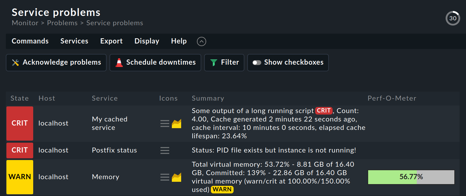
In a view you have numerous control options, among others:
You can navigate to other views by clicking on specific cells — such as the host name or one of the services in the above example.
By clicking on a column’s title, you can sort by that column.
The menu Display > Modify display options shows some settings for customizing the view. Entries per row lets you choose in how many tables the objects are displayed next to each other in the view (e.g. to make full use of your wide screen). In the example above the value is set to
1. With Refresh interval you can set the number of seconds after which the view is automatically reloaded — after all, status data can change at any time.You can reduce the number of table entries after clicking Filter with the filter bar — which is not really necessary in the example shown, but which is very helpful with long tables.
The views have many more possibilities — both for customization and for creating your own views. You can find out how to do this in the article on views.
4. Sidebar
The sidebar is your Checkmk cockpit. It is the place where you have a continuous overview of the most important monitoring information, as well as quick access to the functions that you need most frequently in Checkmk.
You can compose the complete sidebar according to your preferences. The sidebar elements, also called 'snap-ins', serve this purpose. Snap-ins are compact GUI containers with predefined functions. Since the sidebar is intended to hold your preferences, by default a new installation contains only a few snap-ins:
Welcome to Checkmk — Show slideout with the content of the welcome page
Overview — An overview of all monitored objects with their current status information
Bookmarks — Your personal bookmarks within Checkmk
Master control — Various main switches for the monitoring
If you click on  at the very bottom of the sidebar, the main page will show you all the snap-ins that are currently not in your sidebar and that you can add with a single click.
In this preview, the lower area of each snap-in shows a short description about its meaning and function.
Try it out and fill the sidebar as a test.
at the very bottom of the sidebar, the main page will show you all the snap-ins that are currently not in your sidebar and that you can add with a single click.
In this preview, the lower area of each snap-in shows a short description about its meaning and function.
Try it out and fill the sidebar as a test.
Depending on the size of your screen, not all snap-ins may now be visible. The fastest way to move vertically through the sidebar is to use the mouse wheel while the mouse pointer is over the sidebar. On touchpads, this function is often possible with the gesture 'slide two fingers up and down together' method. There are several ways to customize the snap-ins of the sidebar.
Expand or collapse: Click in the displayed title of the snap-in. Alternatively, point to the title bar and then click
 or
or  .
.Show more or less: Some snap-ins (like Overview) offer you two views — either with only the most important information or with all information. Point the mouse at the title bar and click
 or
or  to switch between the two modes.
Move: Press the left mouse button right next to the title, drag the snap-in up or down to another position in the sidebar and release the mouse button.
Remove from sidebar: Point your mouse at the lower right corner of the snap-in until the
 trash can icon appears, and then click the icon.
So much for the options for customizing the sidebar’s content. As a whole, you can hide and show the sidebar — with Sidebar in the navigation bar — and you can move its position from right to left so that it docks with the navigation bar — in the menu User > Sidebar position.
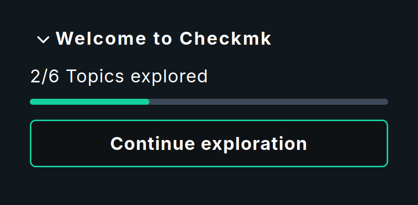
4.1. Welcome to Checkmk
The Welcome to Checkmk snap-in opens a slideout that displays the Topics to explore from the welcome page. The first topic that has not been completed yet will be displayed, so you can pick up where you left off.
4.2. Overview
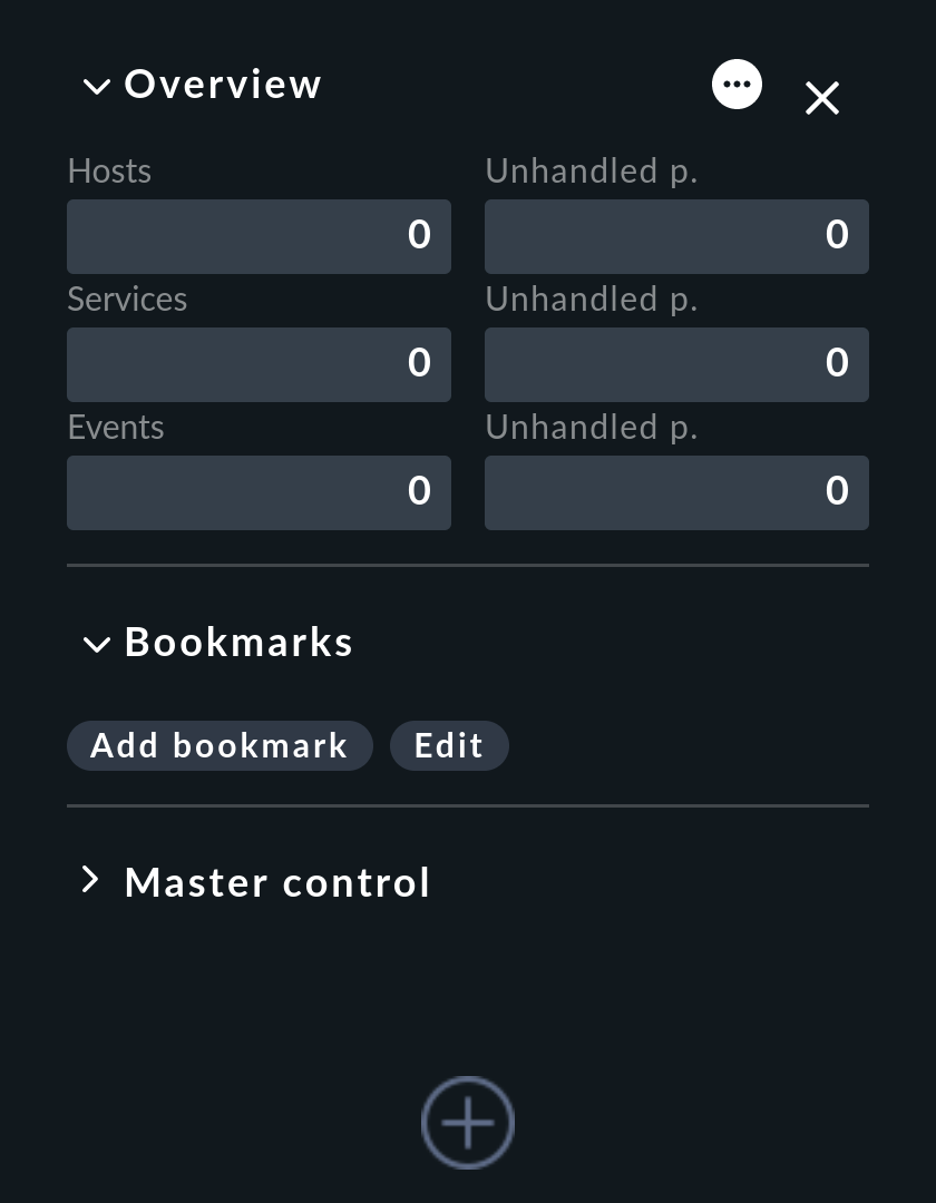
Prominently placed in in the upper area of the sidebar you will find the Overview snap-in:
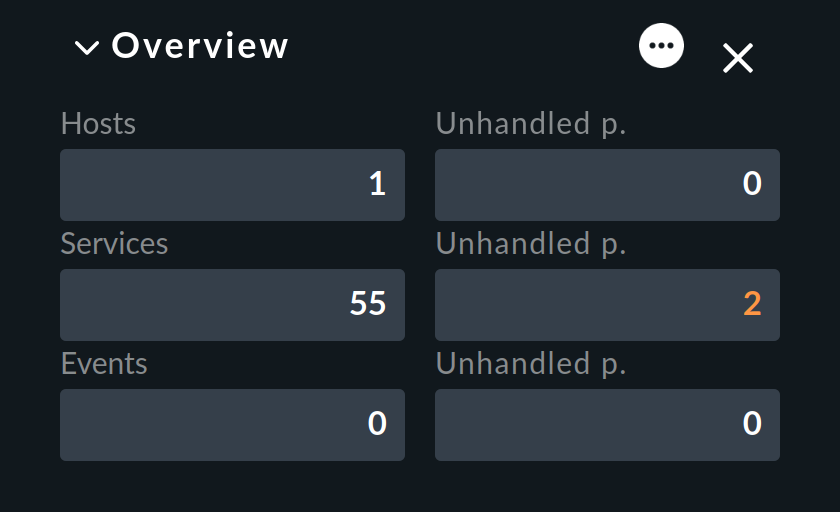
In the left column of this small table you will first see the number of hosts and services you are monitoring. The third row shows Events. These only become relevant for you if you have configured the monitoring of messages. This means, for example, messages from syslog, SNMP traps and log files. For this, Checkmk has its own very powerful module, which will be discussed in detail in the article of the same name, the Event Console.
The right column shows the number of problems that have not yet been acknowledged. Problems are objects that are currently in WARN/CRIT/UNKNOWN or DOWN/UNREACH status. Acknowledgment is a way of 'taking note' of a problem. By the way, problems of services whose hosts are DOWN or in a scheduled downtime are not counted here.
You can click on the number in a cell to get a list of the objects that have been counted here. This works for all cells in the Overview, by the way.
In the Overview you can also decide whether you want to see less or more information.
With the button you can switch to the Show more mode:
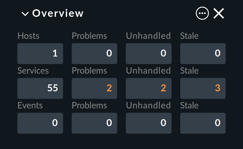
Between the two previously visible columns, the new second column now shows the count for all problems, i.e. with the addition of those that have already been acknowledged. In this example, the numbers in the second and third columns are identical because we have not yet acknowledged any problem.
Finally, the last column on the far right shows the hosts or services whose information is 'out of date' (stale) because no up-to-date monitoring data is currently available for them.
If, for example, a host is not currently accessible, Checkmk cannot retrieve any information from its services.
However, this does not automatically mean that the services have a problem.
Therefore, Checkmk does not simply assume a new status for these services, instead it sets them to the pseudo status 'Stale'.
The column Stale will be omitted by Checkmk from the display if it would only show a 0 in all cases.
4.3. Bookmarks
For pages that you visit again and again, you can create bookmarks in the sidebar with the Bookmarks snap-in.
Do you really need these? After all, there are bookmarks in the web browser. Well, the Checkmk bookmarks have a couple of advantages of their own:
A called bookmark only changes the content on the main page without reloading the sidebar.
You can share bookmarks with other users.
When setting bookmarks, the re-execution of actions is automatically prevented.
At first, the Bookmarks snap-in is still empty:

If you now click Add bookmark, a new bookmark will be created for the content currently displayed on the main page:

Your personal bookmarks are stored under My Bookmarks.
Editing bookmarks
Checkmk manages bookmarks in lists. Each list contains one or more bookmarks. In addition, each bookmark is assigned a topic. All bookmarks on the same topic are collected in the Bookmarks snap-in.
Why so complicated? So that you can make a list of bookmarks visible to other users. You can then use the topics to define how the bookmarks will be presented to other users in the Bookmarks snap-in. In this way, for your organization you can build a navigation structure for selected Checkmk pages and even to external pages. Every user can nonetheless still create and manage their own bookmarks.
With the Bookmarks snap-in you can access the management of the bookmark lists:
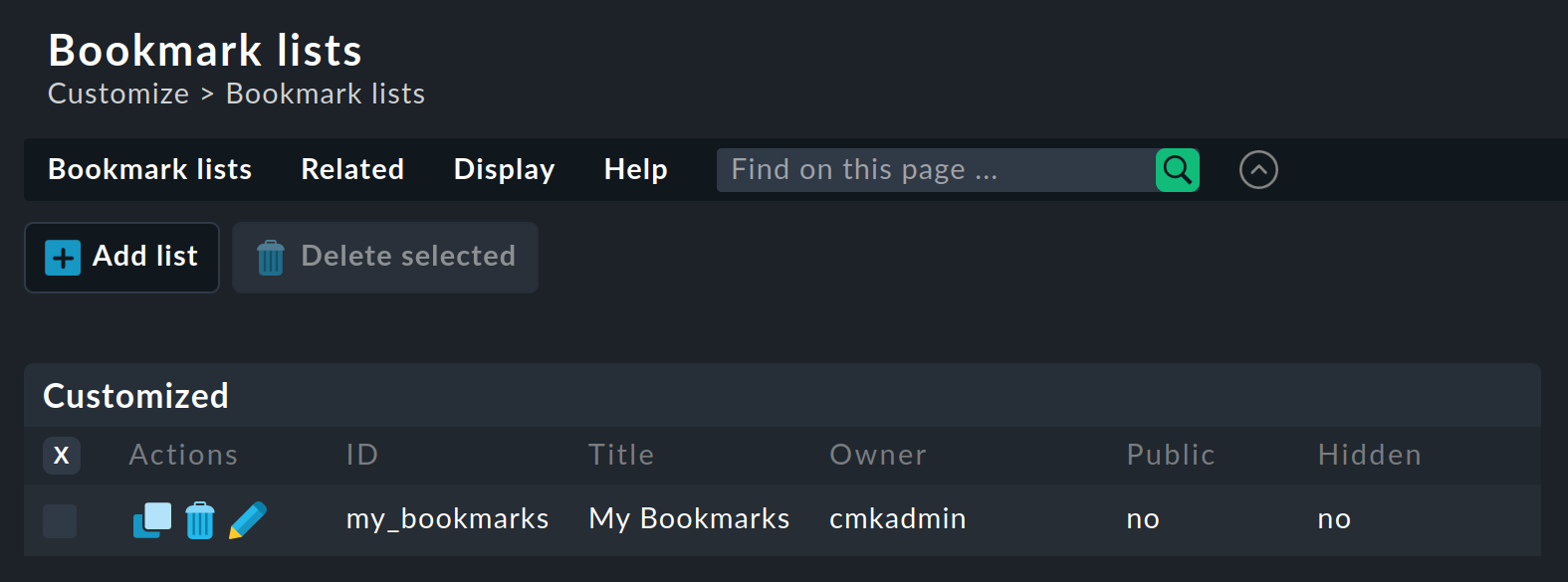
You can now either edit an existing list with — or create a new one with Add list:
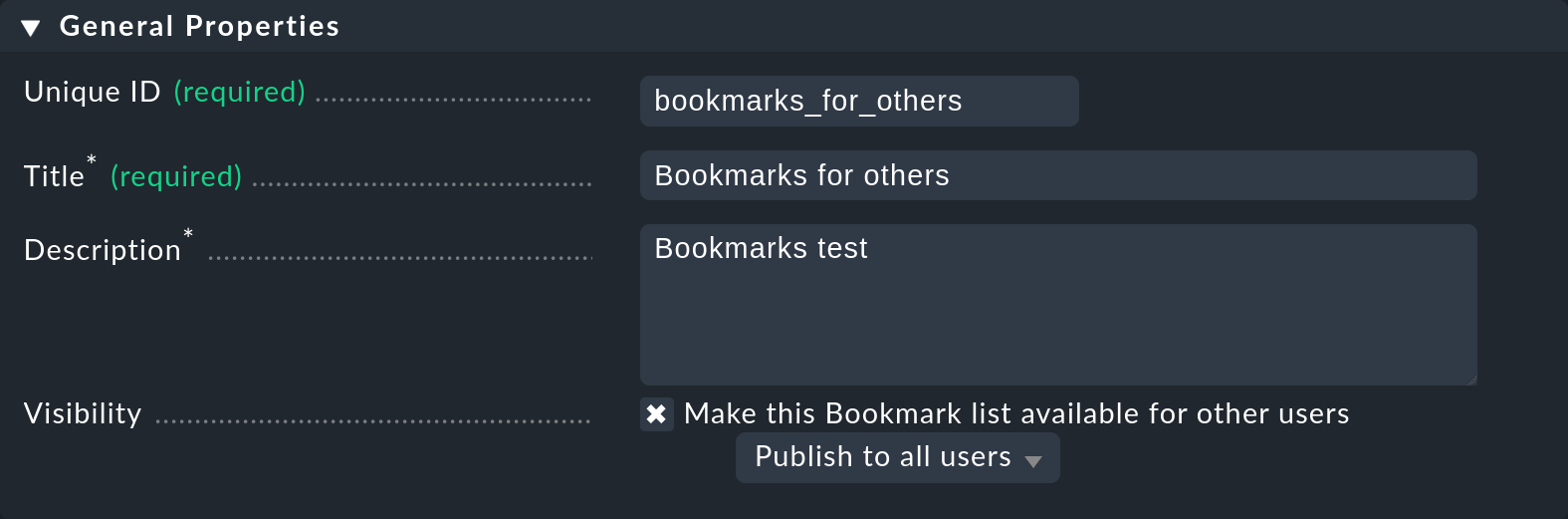
In the General properties box you enter the internal ID and the title of the list — whereby the Title is not important for the display of the bookmarks, it is only used for management. Via Make this Bookmark list available for other users you can make the bookmarks in this list visible to other users. For this, however, your current user account needs a permission, which by default is held only by the Administrator role.
|
The principle of visibility is used by Checkmk in many locations, and is explained in more detail in the Views article. |
In the Bookmarks box you can now define the new bookmarks with a title and URL:
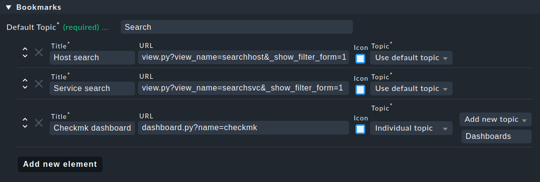
Where the bookmarks are sorted is decided by the Default topic in the list, or respectively by a bookmark’s Individual topic — if this has been set. By the way, you can also give bookmarks their own icons. Finally, save the new list with Save & view list.
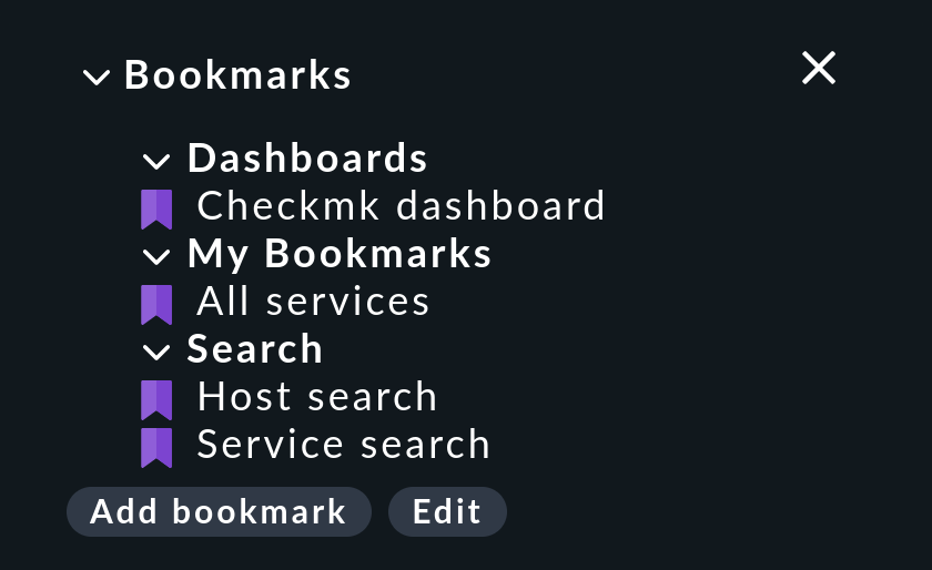
The new list created in this example now supplements the personal bookmarks under My Bookmarks for all users with three bookmarks on two new topics:
4.4. Master control
In the Master control snap-in on the sidebar, you can switch various monitoring functions off and on again individually, such as the Notifications. This latter is very useful if you are carrying out major modifications to the system and do not want to annoy your colleagues with unnecessary messages.
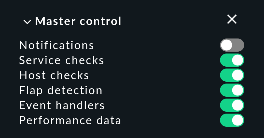
|
Make sure that all switches are turned on during normal operation, otherwise important monitoring functions may be switched off. |