1. Introduction
The aim of monitoring with Checkmk is to provide you at all times with a clear picture of the actual state of your IT infrastructure. The recording of all this information in databases allows you to look back into the past at any time, to create performance graphs and to identify correlations that may have led to problems.
And even if, for example, a glance at the graphs of a file system already provides a rough idea of when space might be tight, this quick impression is often deceptive. It leaves out central elements of capacity management. Seasonal factors, for example, leave much room for misjudgements. The demands on your IT infrastructure can change, for instance, during holiday periods, public holidays or even in relation to the seasons, and these factors are not always trivial or obvious.
Another important factor in the calculation of forecasts are one-off effects. For example, if a linear regression for extrapolation is utilised during a large clean-up operation on a file system, the storage space consumed by the process itself could give the impression that your file system will be completely empty in the near future. The fact that this is a wrong conclusion is immediately obvious and demonstrates strikingly why much more reliable predictions require much more robust methods.
Such robust methods, which, based on the collected historical data enable a clever interpretation and, if configured correctly, good predictions, are provided by Checkmk from version 1.6.0 onwards. In this article we will show you how these can be set up.
2. Configuration in Checkmk
2.1. Creating a forecast graph
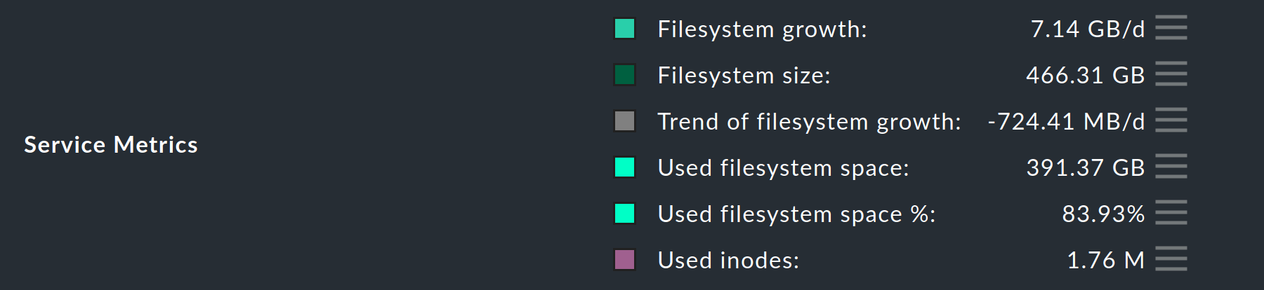
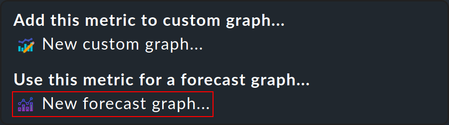
By far the easiest way to create a forecast graph is to go to the detail view of any service that produces metrics. In such a detailed view, you will find the line with the Service Metrics directly below the service graphs. Behind the current values of each of these metrics you will find a button for the special action ![]() for metrics.
for metrics.
Now open the action menu and select New forecast graph….
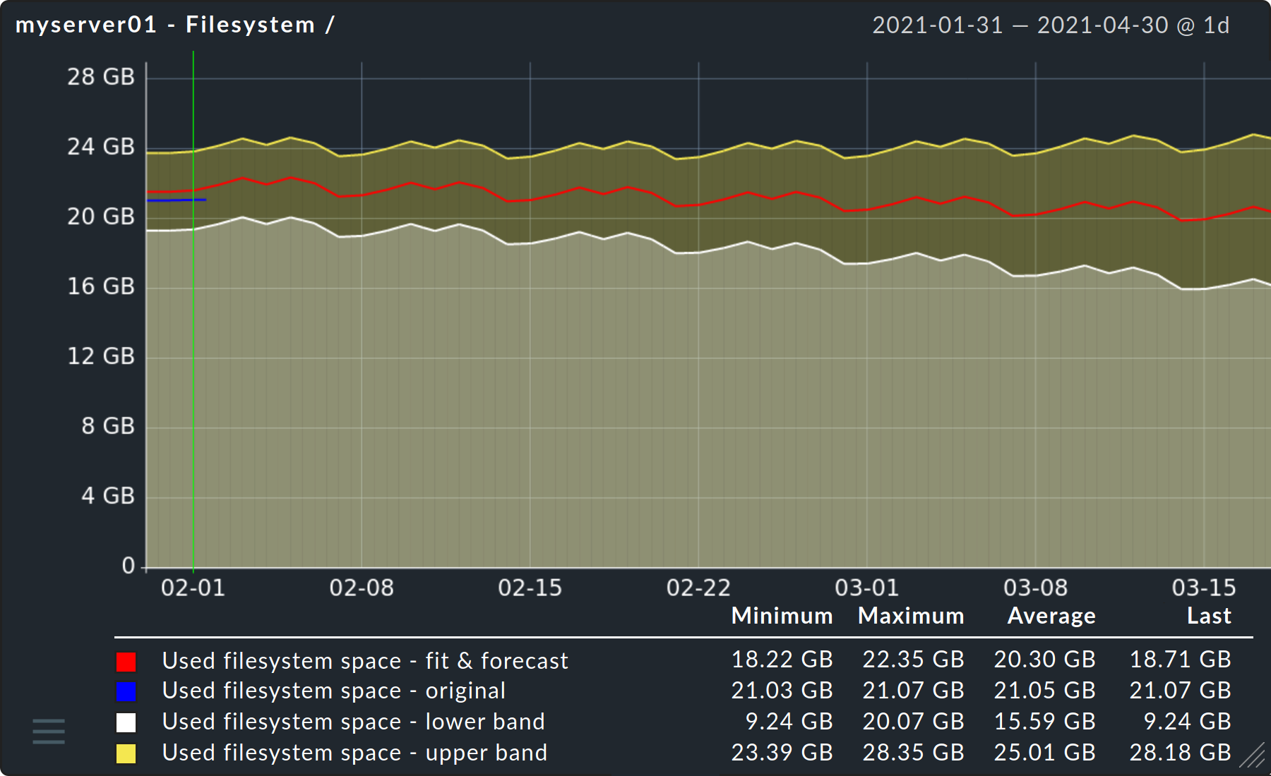
After a few moments you will already be able to see the first forecast graph for the metric you have chosen.
2.2. The model parameters
Now it is time to select the specific parameters for calculating the forecast for this metric — to be found directly below the graph. As these parameters are very much dependent on your particular environment and the purpose of the forecast, a thorough examination of the options and their possible effects is very important.
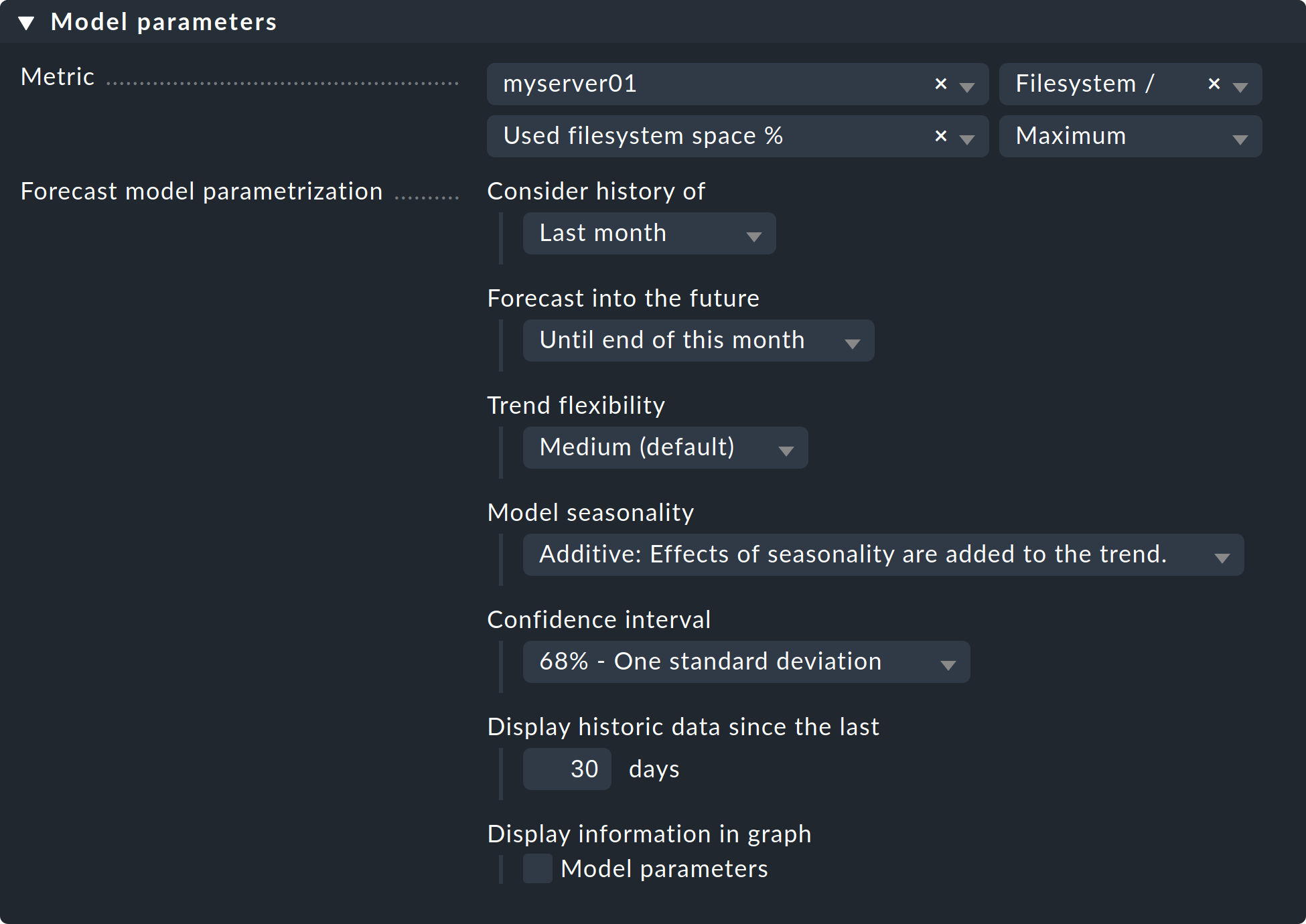
Minimum - Maximum - Average
The last field in the line Metric can already have a considerable influence on how meaningful the prediction will be. The default at this point is always the Maximum option, because in the context of capacity management, this option most frequently provides an indication of the very prediction — bottlenecks at peak loads. For example, if you used look only at average values for the CPU utilisation service, you might see that the average utilisation is still acceptable. However, in the foreseeable future, you would only notice in the monitoring that your CPU is constantly reaching its limits during peak loads when the actual situation arises.
Consider history of
With this option you can determine which period of the historical data is to be used as the basis for calculating the forecast. In general, it can be said that many data points are needed to enable a good fit. However, if you always want to take the measured values of the previous month as a basis, for example, you can do this by selecting the Last month option. This does not mean from the past 30 days, but rather from the previous calendar month.
Another reason to limit the period could be, for example, an upgrade of individual components on a server. The inclusion of data before this upgrade could possibly distort the prediction.
Forecast into the future
The forecast starts on the last day of the period selected under Consider history of. This is worth mentioning, because depending on the selection a prediction is also calculated for a period in which real measurement data has already been accumulated. Within this overlap, it is therefore already possible to see how close the prediction was to the actual values.
Furthermore, it only remains to say here that the further you try to look into the future, the more imprecise the prediction will naturally become. However, this banality is illustrated very well in the forecast graph by the ever-increasing orange shading.
Trend flexibility
When observing and analysing time ranges — in this case, the values recorded for your services — so-called structural breaks or changepoints play a very important role. To put it simply, these changepoints are those moments in the time ranges at which more or less large changes can be observed. During the analysis of the time frames Checkmk now identifies a whole series of these changepoints and uses them in order to reuse them in the forecast and thus make it more precise. How strongly Checkmk adjusts the curve of the forecast graph to these changepoints, can be determined via the five Trend flexibility options. If the adjustment is too strong — a so-called overfitting — the prediction function would too closely resemble a simple update (basically a copy) of the previous time series. An underfitting on the other hand, would make the prediction extremely inaccurate. Checkmk provides a standard value that is good for many situations and we can use this with Medium. Should your forecast graph be too inaccurate — underfitting — you would have to increase the flexibility of the trend curve by selecting High or Very High. In the opposite case — i.e. overfitting — you would still have the two options Low and None (linear), although we do not recommend using None (linear), because this is only available for the sake of completeness.
Model seasonality
At this point you will need to determine how the forecast graph should handle recurring and seasonal demands on your infrastructure. Two time frames are automatically considered in the forecast graphs — weekly recurring requirements, such as for a five-day working week and weekends, and annual or seasonal requirements, such as those related to public holidays and staff holidays. Checkmk recognises this seasonality automatically, so all you have to do is select how you want it to be forecast.
The Additive option includes these changed requirements in the prediction only once. As the name suggests, the increased or decreased demand is simply added to the trend.
With the selection of Multiplicative, on the other hand, the future seasonal demand increases or decreases proportionally to the trend.
Confidence interval
At this point you will need to determine the confidence level for your prediction. In simple terms, this is where you specify the probability with which the values to be expected should lie within the confidence interval resulting from this level. The aim of such a selection is, from the highest possible level, to always obtain an interval that is as narrow as possible. The more historical data that is available, the more successful the forecast graphs can be in achieving this. It is important that this selection does not influence the actual 'fit'. Only the area surrounding it (i.e. the visualisation of the interval) becomes correspondingly larger at higher levels.
Display historic data since the last
In the forecast graph, on the left-hand side you see — separated by a vertical yellow line — the visualisation of a specified number of days of actually excellent data. You can specify how many days should be displayed here. This value has no effect on the calculation of the forecast itself, but only influences the display.
Display information in graph
And the last option again only influences the display of the graph. If you check Model parameters, the previously selected parameters will be displayed below the finished graph. This makes it easier for the viewer to interpret the graph.
3. Diagnostic options
3.1. Possible errors and error messages
Cannot create graph
The error message Cannot create graph - Metric historical data has less than 2 days of valid values is largely self-explanatory. To be able to make meaningful predictions Checkmk needs more than 2 full days of historical measurement data. With fewer measurement points as a basis, a halfway serious fit is simply not possible.