1. Introduction
1.1. What are dashboards actually?
Dashboards are the central displays for your monitoring in Checkmk. They provide you with both overviews and detailed insights into specific areas. For example, you can visualize the general status of entire network segments, but also simply list which services are generating a load or overload of certain system resources. Checkmk comes with some standard dashboards, such as for problems, Checkmk server statistics and of course a general overview. However, you can also create your own completely individual dashboards from scratch.
In this article you will learn which tools are available for this and how exactly you can use them to create your own overviews. First, we will show you how dashboards work and how to work with them. Afterwards, we will shed light on the basics of Layout and Configuration, in order to build on this and step by step create a complete, simple example dashboard. Then follows a short summary on the topic of filters, as these can be set in a number of different locations. It continues with a presentation of all of those already built-in dashboards and widgets — the individual building blocks for overviews. Finally, there are tips on how to deal with errors and problems.
By the way, you can see the most striking dashboard directly on the Checkmk start page, but dashboards can be treated like other views and easily accessed via the navigation bar and the sidebar.
Dashboards are, of course, ideally suited to be placed separately on individual monitors, be it for a large control room, as an information display for server rooms or as a simple kiosk display for the conference room.
1.2. What dashboards can do
What sets Checkmk dashboards apart is our very own anchored layout: Using a smart algorithm, dashboards automatically adjust to the dimensions of the display or browser window. You can specify exactly how each individual element of the dashboard—the widgets—behaves and in which directions they expand when necessary.
Starting with version 2.5.0, the commercial editions also include an alternative responsive layout: Here, you can easily design your layout using drag-and-drop, and the layout automatically adapts to different screen sizes.
For a comparison of the two systems and further details, see the chapter Layout.
Widgets of various categories are available for the content: Regular views, graphs, metrics, prefabricated elements for various statistics and timelines as well as boxes for static texts and any URLs. An overview of all widgets can be found below.
Some of the widgets are available exclusively in the commercial editions.
An important feature of dashboard use: Using filters, even dashboards that show values for all hosts or services in the network can be broken down into specific areas. Dashboards are therefore not simply rigid displays, rather they are real tools for finding and analyzing problems and states.
1.3. Dashboards in operation
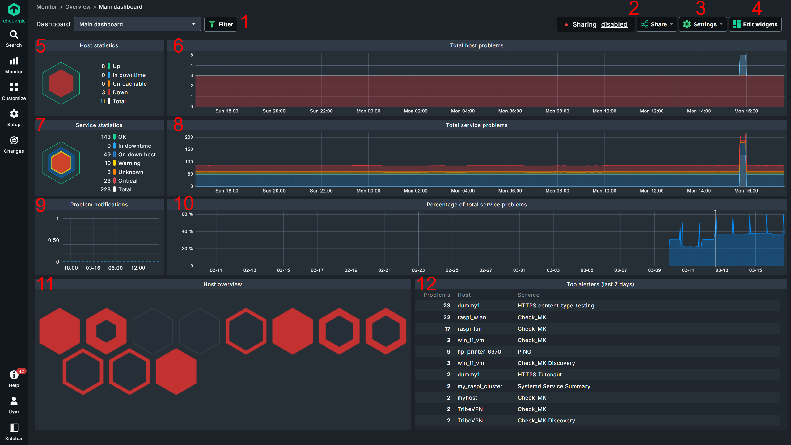
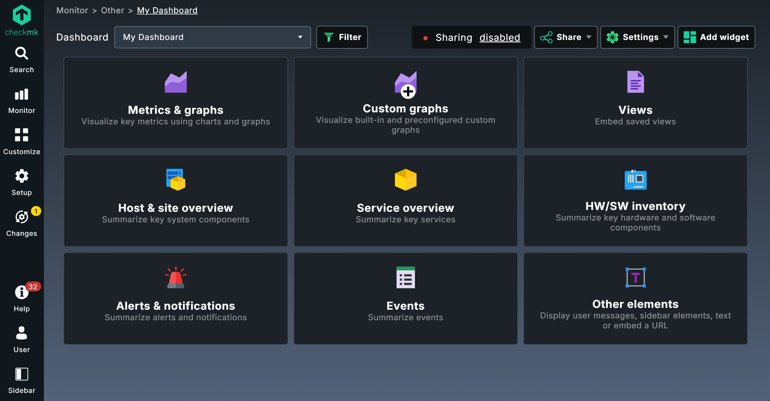
Interpreting the Main dashboard
On the Checkmk start page you will see the Main dashboard, which can be found in the Monitor menu and also in the Views snap-in, each under Overview > Main dashboard.
Checkmk Community and commercial editions each come with their own individual standard dashboards, so here is a look at the commercial editions variant first:
| No. | Title | Function |
|---|---|---|
1 |
Filter |
Open runtime filter |
2 |
Sharing |
Status and settings for dashboard sharing |
3 |
Settings |
Settings for dashboards and default filters |
4 |
Edit widgets |
Toggle layout mode |
5 |
Host statistics |
Current status of hosts |
6 |
Total host problems |
Timeline of host problems |
7 |
Service statistics |
Current status of services |
8 |
Total service problems |
Timeline of service problems |
9 |
Problem notifications |
Timeline of alerts |
10 |
Percentage of total service problems |
Timeline of active services |
11 |
Host overview |
Visualization of host problems, zoomable with mouse wheel |
12 |
Top alerters (last 7 days) |
Services responsible for alerts |
If you move the mouse pointer over the graphs or the host symbols in the Host overview widget, you will immediately get more detailed information via a tooltip. The colors correspond to the display in the widgets for the current host and service statistics.
The linked title lines of the widgets take you to more detailed displays.
On  Checkmk Community, however, the main dashboard on the start page is the Problem Dashboard, which can also be called up in the commercial editions via Monitor > Problems > Problems dashboard and which, quite conventionally, shows unresolved problems and current events in the form of a list:

| No. | Title | Function |
|---|---|---|
1 |
Filter |
Open filter |
2 |
Sharing |
Status and settings for dashboard sharing |
3 |
Settings |
Dashboard settings |
4 |
Edit widgets |
Toggle layout mode |
5 |
Host statistics |
Current status of hosts |
6 |
Service statistics |
Current status of services |
7 |
Host Problems |
List of unresolved host problems |
8 |
Service Problems |
List of unresolved service problems |
9 |
Events of recent 4 hours |
Events from the last four hours |
 |
Note on the Edit widgets-link for switching to layout mode:
For the built-in dashboards, you will not see this button at first by default!
It only appears, and then permanently, once you have cloned the dashboard via the settings menu or from the dashboard list.
Just understand this as a small protective measure, because it is recommended to first clone |
Filtering dashboards
As you will see later, dashboards can be created from the outset for a desired selection of hosts or services. However, you can use filters to temporarily limit each dashboard to a specific selection:
Call up the filter function via
 .
.Add a filter via Add filter — for example Host name (regex).
Configure the filter — for example
myhost.
The third step varies from filter to filter.
The most important thing here being the handling of the search terms entered, i.e. for host names, for example.
As usual, Checkmk evaluates these as regular expressions.
A filter for myhost would therefore find myhost as well as 2myhost and myhost2.
If you only want to see myhost in the dashboard, you must use ^myhost$ as the search term accordingly to include the beginning and end of the line and thus specify an exact match.
Several filters can of course also be combined, which can then reduce the number of hits by using AND links.
Within a filter you may use OR links by means of regular expressions, for example myhost1|db_server.
2. Layout systems
Checkmk provides two completely different layout systems for its dashboards: our traditional, in-house Anchored layout and, in the commercial editions starting with version 2.5.0, an alternative Responsive layout.
 The responsive system is available exclusively in the commercial editions.
This is more intuitive and adheres to standards: You position and resize widgets manually using the mouse.
If the viewport changes, the layout is automatically optimized—meaning widgets are automatically arranged and scaled to fit the viewport size. This is useful, for example, for unusual display sizes or for viewing on different devices, such as dashboards that sometimes need to be displayed on a desktop and at other times on mobile devices.
The responsive system is available exclusively in the commercial editions.
This is more intuitive and adheres to standards: You position and resize widgets manually using the mouse.
If the viewport changes, the layout is automatically optimized—meaning widgets are automatically arranged and scaled to fit the viewport size. This is useful, for example, for unusual display sizes or for viewing on different devices, such as dashboards that sometimes need to be displayed on a desktop and at other times on mobile devices.
The Anchored system focuses the layout dynamics directly on the widgets rather than on the entire dashboard: Widgets can be created with fixed heights and widths, but they can also automatically expand in both dimensions to always fill the dashboard optimally—so that widgets are scaled according to your preferences, while the overall layout remains intact.
You choose which of the two layout systems to use right at the start when creating a new dashboard—and this choice is final, it cannot be changed later. By the way, there are no differences in terms of functionality; all widgets are available in both layout systems.
Below you will see how the alternative systems perform in practice. But the best way to understand their dynamics and differences is still to try them out for yourself!
2.1. The responsive layout
This layout system is completely intuitive: You place widgets using drag-and-drop, and resize them using the handle in the lower-right corner. Here is an example, for simplicity’s sake, featuring eight versions of the same Site overview widget:

For example, if this dashboard is viewed on a mobile device, or if you simply resize the browser window to make it a bit narrower—as shown here for demonstration purposes—the layout and scaling of the widgets will adjust accordingly:

The big advantage: Everything happens automatically. The downside: If you want to display a specific widget—such as a graph with a timeline—across the full width at all times, this system doesn’t allow for that.
2.2. Anchored layout
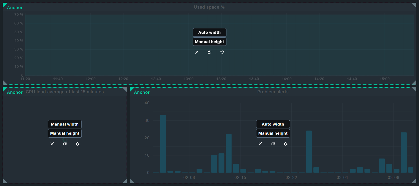
The principle is simple: any corner of a widget is set as an anchor. From this fixed point, the widget can then grow in height and/or width as soon as more space is available, for example, simply on a larger screen, but also when the position or size of other widgets changes.
To illustrate this function, here is an example — in the center a host matrix widget with manual height and width settings, and in its upper left corner an anchor. You can recognize the anchor by the green corner, the settings for current height and width can be found in the middle of the widgets.
This is framed by four host-overview widgets, all with automatic height, the side ones also with automatic width — the widgets at the top and bottom get the setting max width. By default, the anchor is at the top left, but here the right widget gets the anchor at the top right and the bottom one at the bottom left.

If you now move the widget in the middle further to the left and down, for example, the widgets on the left, right and bottom change — because they automatically grow from their anchors towards the central host matrix widget.
The top widget, on the other hand, remains as it is — after all, it cannot grow downwards because the two side widgets are anchored at the top.

If you now switch the lower widget from Max width to Auto width it no longer extends over the entire width — because the automatic height of the right widget is rendered before the automatic width of the lower widget.

If widgets with automatic dimensions are competing for the same space, you can use the maximum setting to determine the winner, so to speak — but be careful: If two widgets set to maximum compete for the same space, overlapping can occur.
The whole dynamic layout principle is easier to understand if you create such a test setup yourself and try pushing the widgets around a bit.
3. Configurations
3.1. Dashboard
You will see the dashboard configuration automatically when you create a new dashboard, later you can access it via the icons in the dashboard list (Customize > Visualization > Dashboards) or the Settings > Dashboard menu item in an open dashboard.

The properties of the dashboard itself are trivial; only metadata such as name, menu item or visibility are defined here.

3.2. Widgets
You can view the configuration of individual widgets automatically when you add them to a dashboard. Later, in the layout mode, you can access their configurations directly via the gear icon on the widgets.

By the way: In the Responsive Layout, the widgets look slightly different, but the icons are the same:

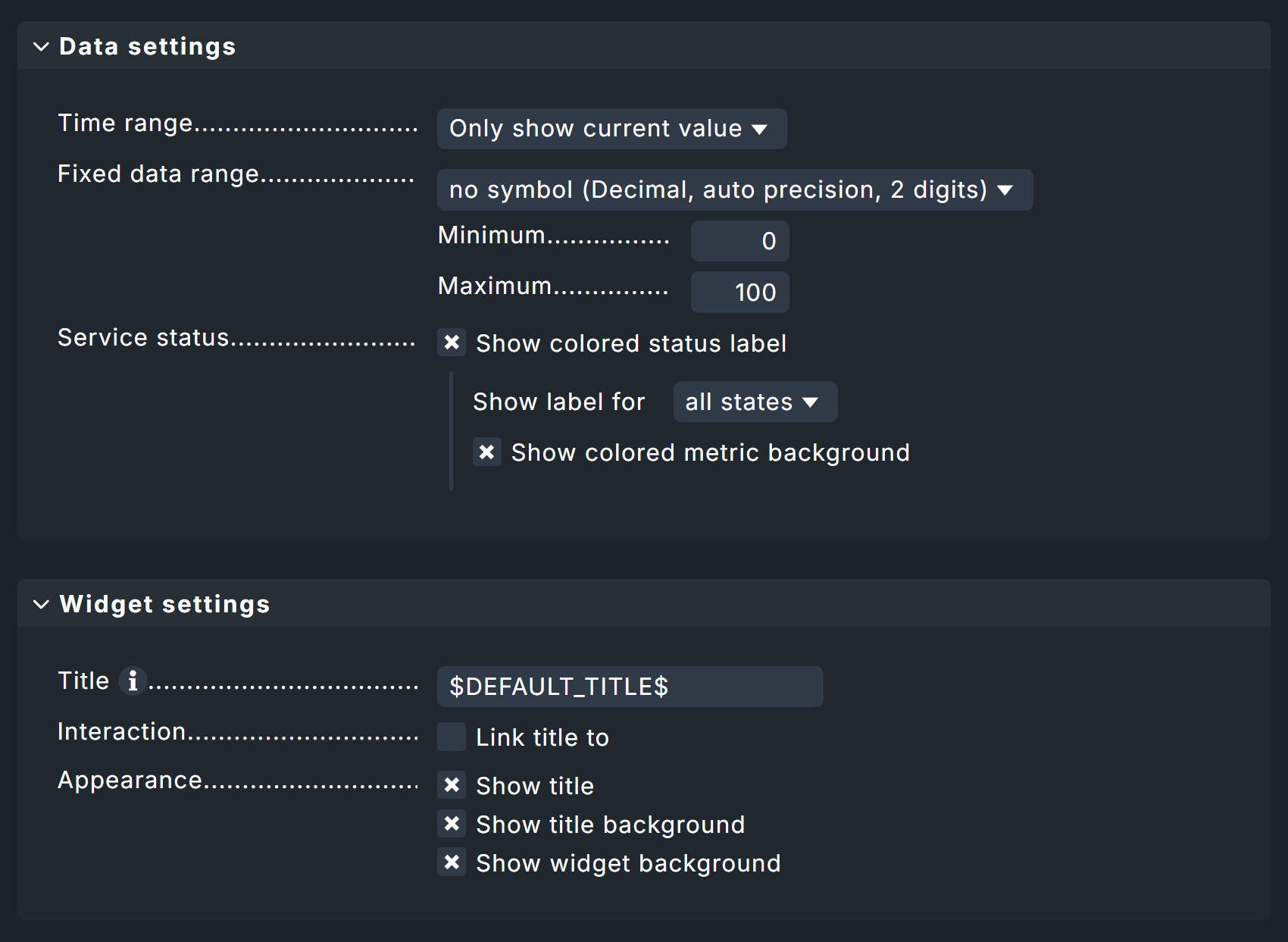
Configuring most widgets is quite simple. Typically, you will find Data settings for limiting and displaying data, as well as Widget settings with options for titles, links, and so on—here using the Gauge widget as an example.
For all widgets that refer to some or specific hosts and services, you will also find corresponding filter options.
A detailed description of the filters can be found in the chapter Filters, and specific examples of widget configurations in the chapter Example Dashboard.
3.3. Permissions
Even away from the dashboard and widget configuration, there are important settings in Checkmk, namely permissions.
Under Setup > Users > Roles & permissions > Edit role user you can simply filter for dashboard to list all options.
Here for a role you can specify in detail which standard dashboards its assigned users can see and what exactly they are allowed to do with other dashboards.

3.4. Filter
Filtering dashboards and widgets is a powerful feature available in several forms. Here is an overview:
-
Dashboard configuration
Default filters
Runtime filters — without values
-
Widget configuration
Widget filters
-
Dashboard view
Runtime filters — values set by the user
Default filters set specific criteria for the entire dashboard; for example, the Host name (exact match) filter with the value myhost.
Setting Runtime filters in the dashboard configuration sets empty defaults for the entire dashboard—for example, the Host name (exact match) filter—and users must then set these themselves at runtime (i.e., when viewing the dashboard). If Runtime filters are set in the configuration, the dashboard starts with the filter dialog open—after all, users must fill these filters with values.
Widget filters are set for each widget in its respective widget configuration. Here, filtering is based not only on hosts and services, but also on metrics (from services) if required.
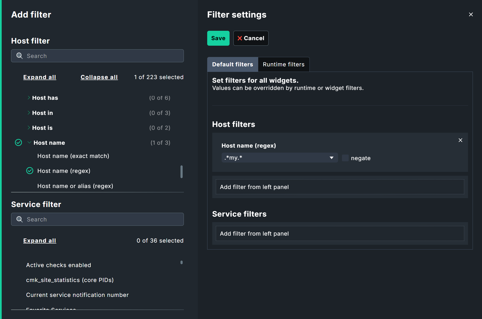
You can access the two dashboard filters from the dashboard via Settings > Filter settings, and the widget filters via the gear icon on the widgets themselves.
Runtime filters are also available outside the configuration in the regular dashboard view — for regular users.
You can access these filters via the Filter button right next to the dashboard selection.
It is also important to note how these filters interact with each other: Widget filters override runtime filters, which in turn override default filters.
The following image illustrates the entire filter spectrum for hosts (points 3 through 5):
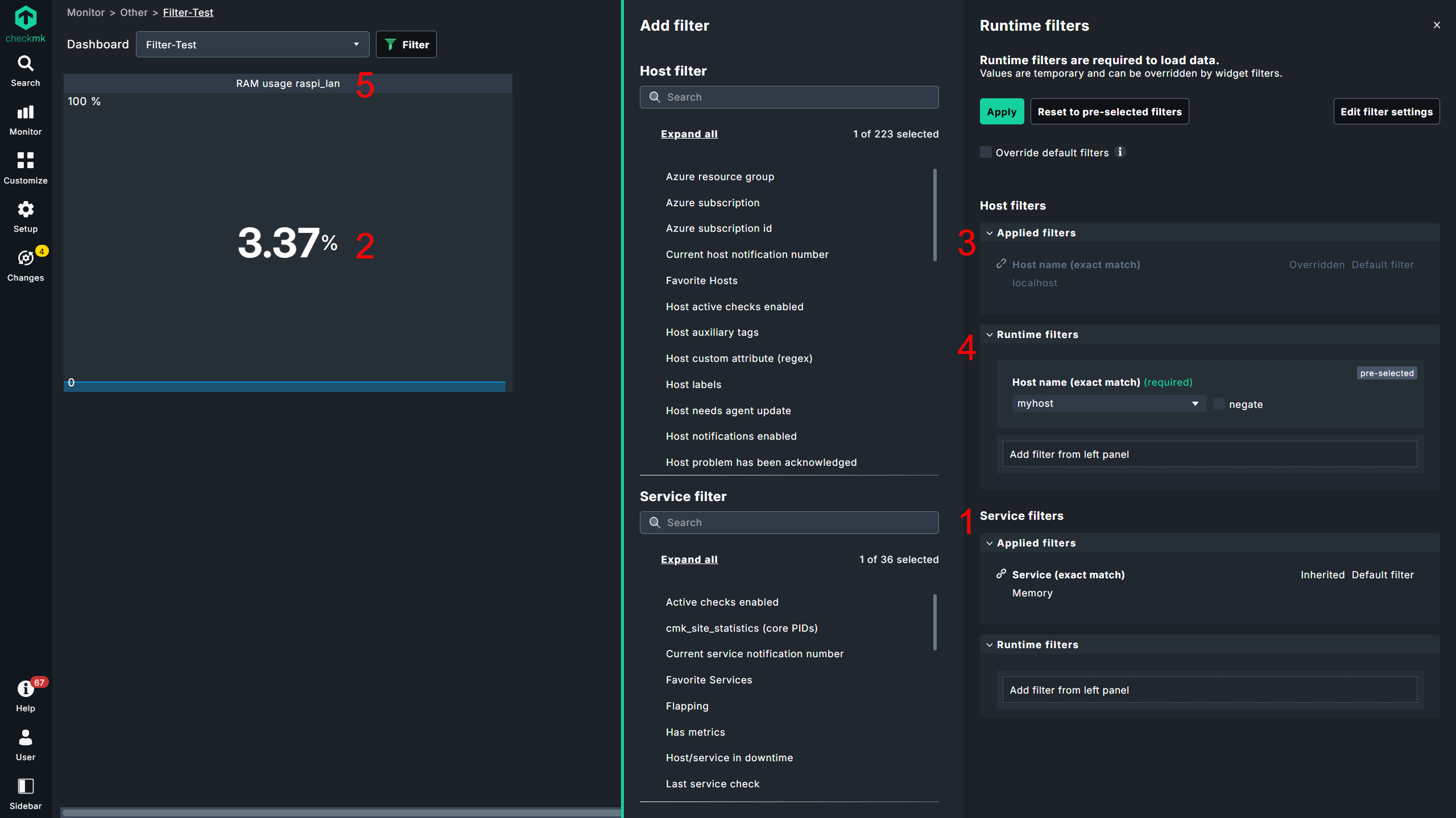
| No. | Title | Function |
|---|---|---|
1 |
Service filter |
Dashboard-wide filter by service Memory |
2 |
Metric filter |
Widget-specific filter on the metric RAM usage |
3 |
Host filter - Default |
Dashboard-wide filter on the host |
4 |
Host filter - Runtime |
Dashboard-wide filter on the host |
5 |
Host filter - Widget |
Widget-specific filter on the host |
This dashboard includes a predefined Metric widget that always displays the RAM usage metric for the Memory — as standard, via the default filter from the host localhost, which is overridden here by the runtime filter to the host myhost, which in turn is overridden by the widget filter to the host raspi_lan.
In other words: When creating dashboards, you can set dashboard-wide defaults that users can either override (runtime filters in the view) or are required to override (runtime filters in the configuration). Individual widgets, on the other hand, can be configured with fixed settings, preventing users from applying additional filters.
3.5. Sharing
Have you spent hours building a powerful dashboard? It would be a shame to keep it to yourself. That’s why you can share dashboards, both internally and externally.

You can access the corresponding configuration in the respective dashboard via Share > Configure sharing.
An internal link to the dashboard is available by default at Internal access — and this does not affect the status shown at the top of the image (here Sharing paused).

This status applies solely to the public link at Public access; after all, dashboards may well contain sensitive information that is not necessarily intended for public viewing.
As soon as you enable a link here, the status changes from Sharing disabled to Sharing enabled. If public access is enabled and you make changes to the dashboard, you will see the status Sharing paused. To resume sharing, you must share the dashboard again. The sharing link itself does not change.
The only option when sharing: You can set an expiration date for the share.
In Checkmk Community, shares are limited to a maximum of 30 days; in the commercial editions, an expiration date is completely optional.
Shared, public dashboards have a few restrictions for security reasons: navigation and menus are hidden, there are no filtering options, and sidebar elements are not available. Additionally, not all entries may be visible in list views because they are limited by default, and the buttons to remove these limits are missing — again, for security reasons.
4. An example of a dashboard
This example project will guide you through the necessary steps for setting up a dashboard from scratch. In doing so, you will basically see examples of all of the available options. In order to completely replicate this example, you will need one of the commercial editions.
Four widgets serve this purpose:
The Performance graph widget shows a host’s file system usage, Gauge shows the average CPU usage over the last minute, the Alert timeline visualizes alerts for a selection of hosts and services over a timeline, and the Scheduled downtimes view lists scheduled downtimes.
And this is what the finished dashboard will look like:

4.1. Building an example dashboard
Creating a dashboard
First, create a dashboard by going to Customize > Visualization > Dashboards > Add dashboard.
You will be taken to a dialog with three separate sections.
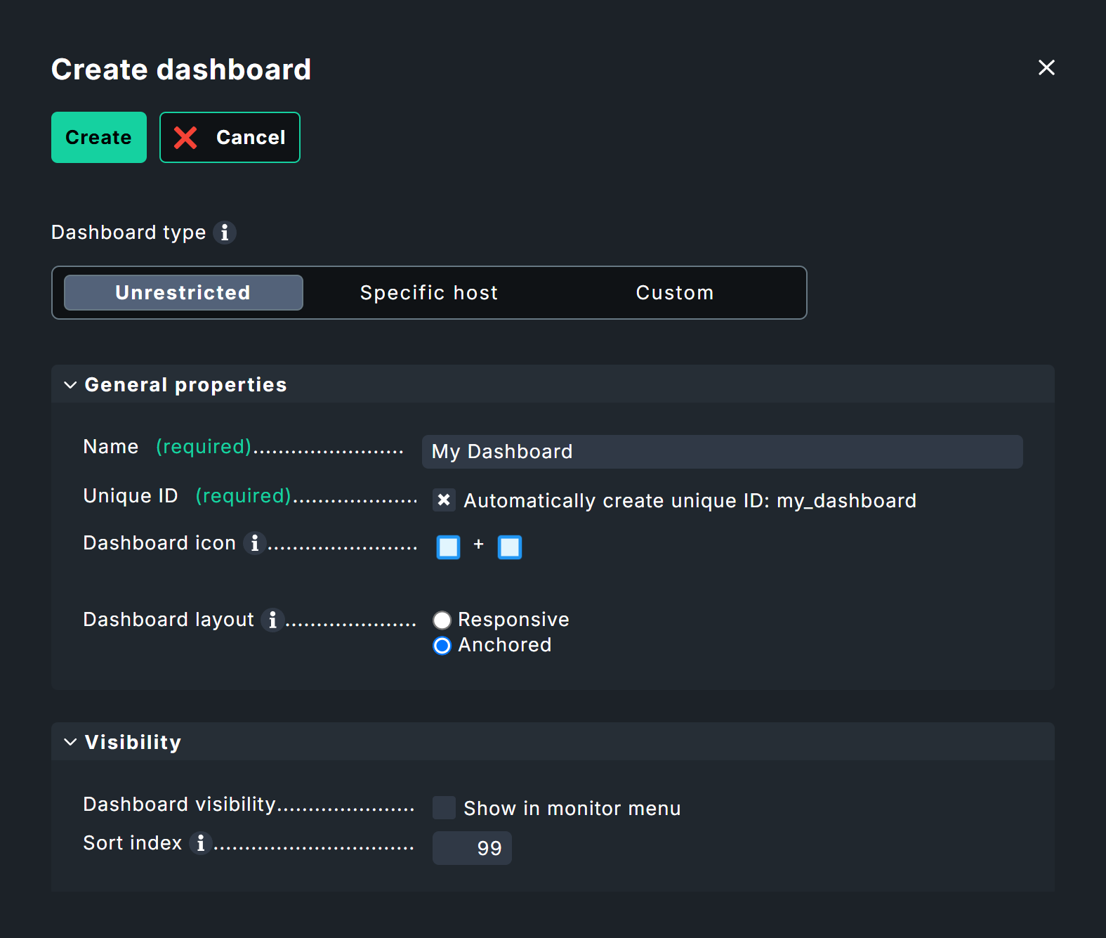
First, select the Dashboard type. This type determines which data is generally available to the dashboard. The default here is Unrestricted — meaning there are no restrictions, and you or dashboard users can filter by individual hosts or services later if needed.
The Specific host type restricts all dashboard visualizations to a specific host. You will later specify which host this is; here, the focus is simply on restricting the data source to "a single host."
With the Custom type, you can specify exactly which data sources are available to the dashboard. These could include, for example, specific hosts, services, and even individual objects such as Docker images or fans.
For this example, leave the default setting Unrestricted as is. You can also filter the results later.
Next, move on to the General properties box.
All that is required here is a name and an ID for the dashboard; the Unique ID can be generated automatically if desired.
However, the Dashboard layout option requires special attention: At this point, you must irrevocably choose one of the two layout options described in the chapter Layout.
For our example, choose the traditional Anchored — simply because there’s a bit more to show here.
In the Visibility box, you can specify whether your new dashboard appears in the main navigation and, if so, in which category. You can also configure this setting later. Additionally, by default, your dashboard appears in the dashboard drop-down menu in every dashboard, as well as in the dashboard sidebar element.
Following this brief initialization, you’ll be taken to the new, empty dashboard — although "empty" isn’t quite accurate. As long as no widgets have been added yet, tiles provide quick access to the available widgets, which can also be accessed in the top-right corner via Add widget.
Dashboard configuration
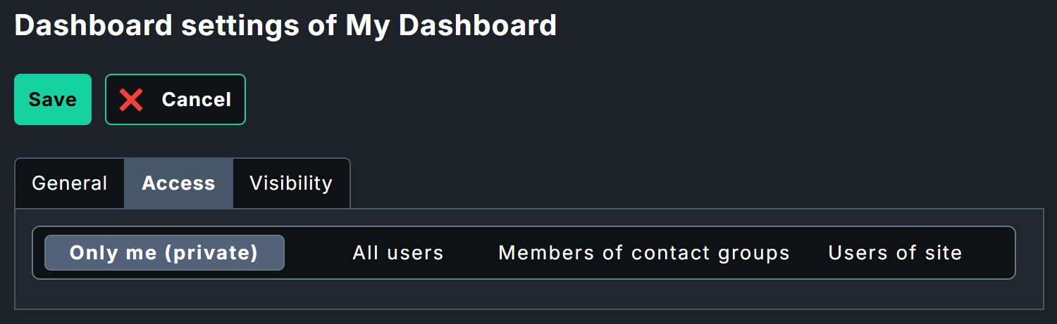
Before you start filling out the dashboard, take a look at the general dashboard settings under Settings > Dashboard settings. In addition to the settings you’re already familiar with from the Add dashboard dialog, you’ll see the Access tab here, which lets you specify exactly who is allowed to access this dashboard—by default — only you!
Filters should also be a part of the basic configuration; you can find these under Settings > Filter settings (more on this in a separate chapter. When creating the dashboard, the Unrestricted type was selected, so that all monitoring data is available to you.
You don’t necessarily need to set filters here for the sample dashboard. However, if you’re working in an environment where hundreds of hosts are already being monitored, it may be worth narrowing down the selection — for example, to only Windows hosts, or hosts at a specific location. You can set filters for individual hosts directly within the widgets.
Adding a Graph widget
The first widget will display the file system usage as a graph. To do this, first configure the desired data, then set up its visualization.
Start the configuration on the blank dashboard by clicking Add widget > Metrics & graphs.
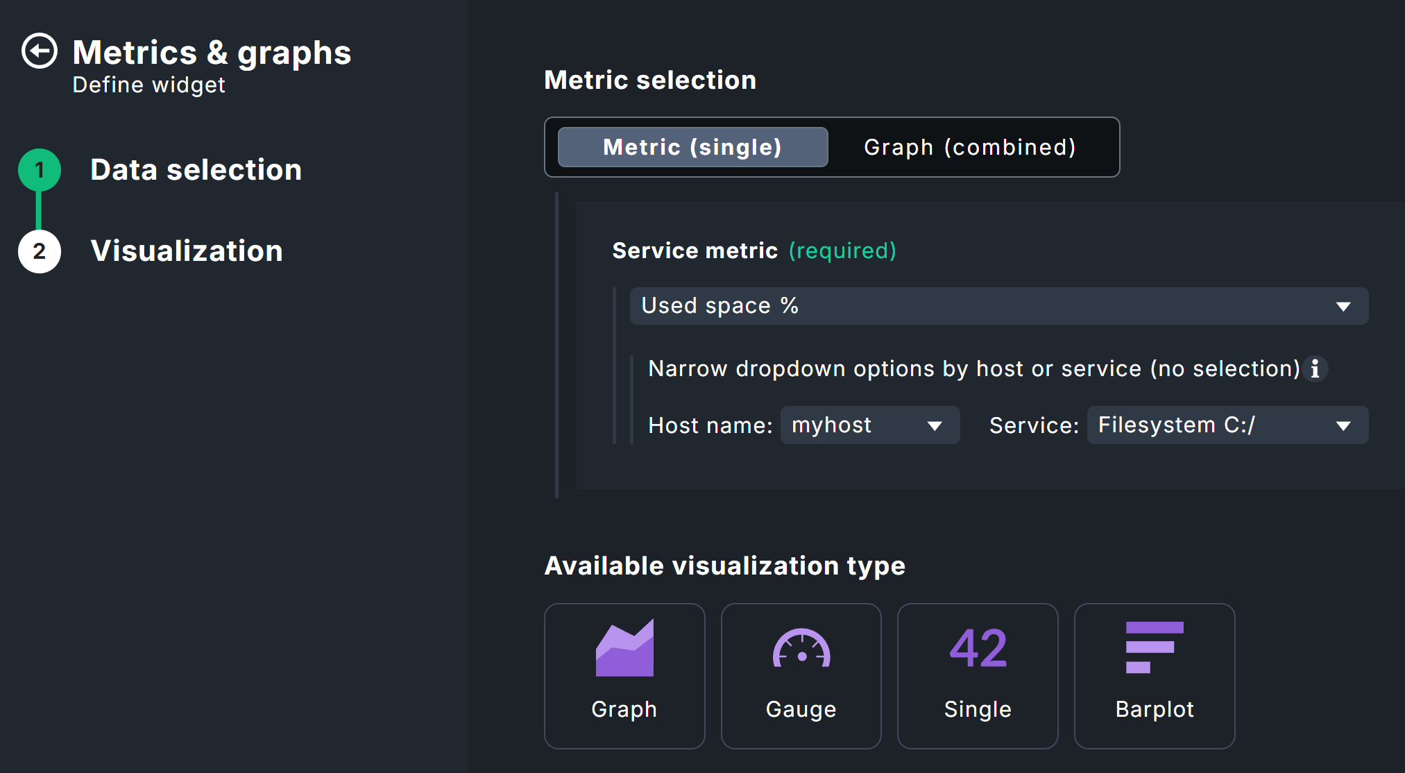
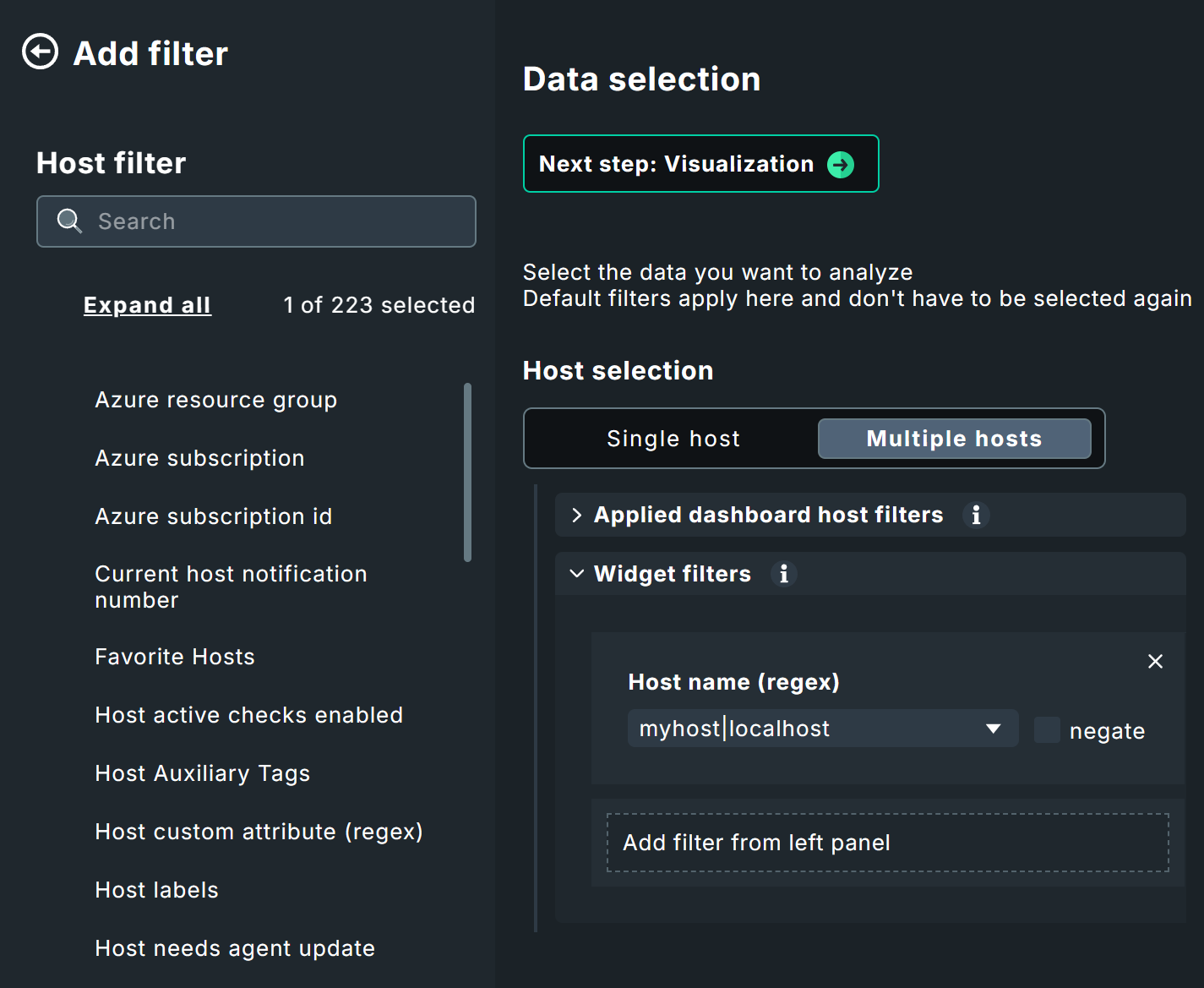
Data selection is done in three steps: Host, Service, Metric. First, set a host filter: For this example, a single, specific host myhost under Host selection > Single host > Widget filters is sufficient.
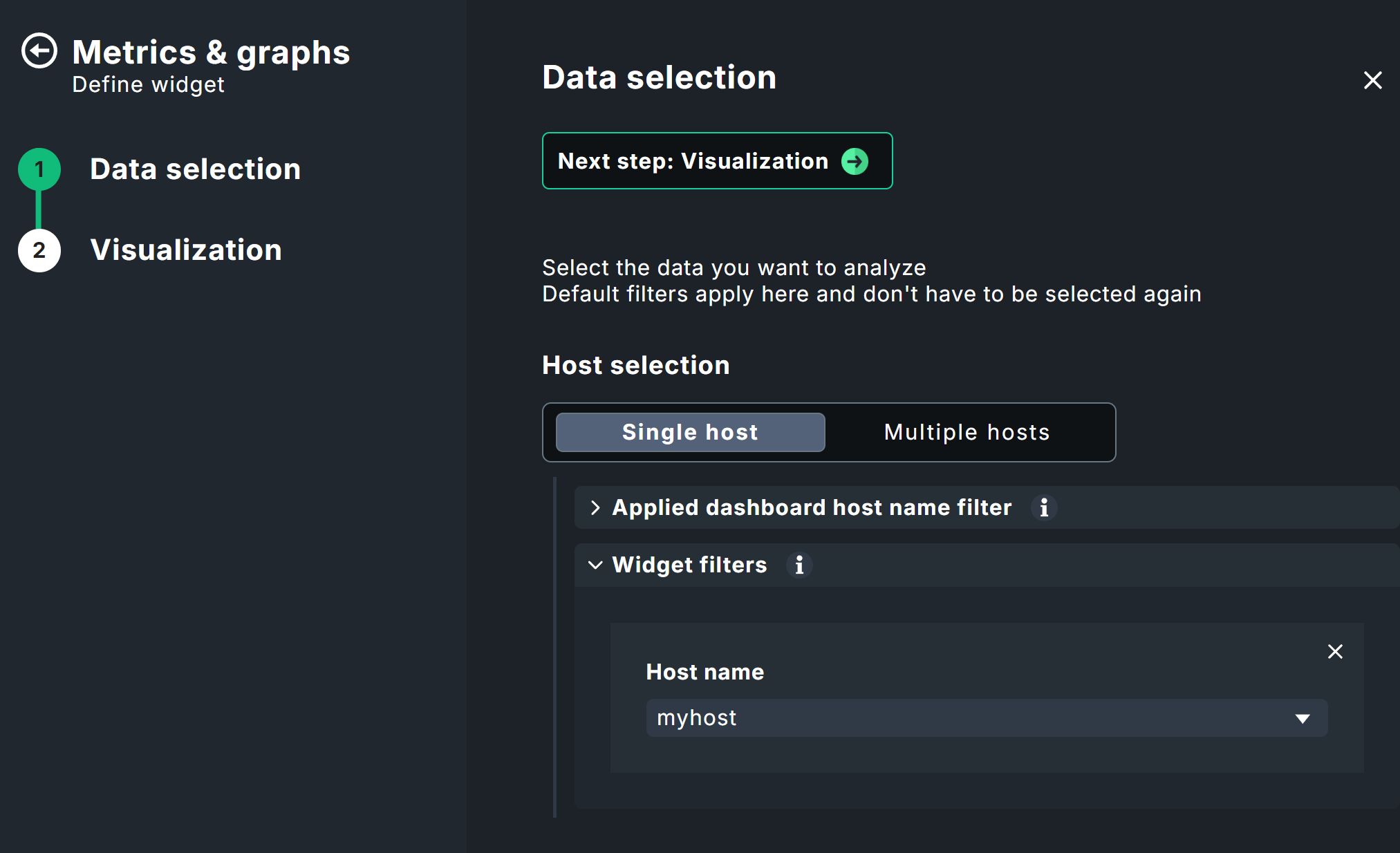
Next, specify the desired service; in this example, Filesystem C:/.

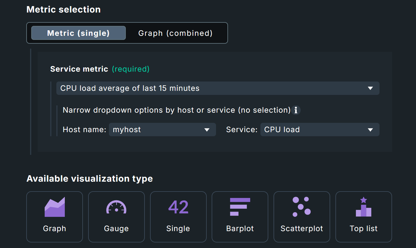
In the third step, select the desired metric under Metric selection > Metric (single) > Service metric (required), in this case Used space %. This drop-down menu is filtered based on your selection of host and service, so that only relevant metrics will be available.
Note: The filter below the service metric selection is only used to filter the drop-down menu and does not override the previously selected host and service — without this filter, the list would be hundreds of entries long!
To continue, click Next step: Visualization at the top of the data configuration, or any visualization at the bottom.
Several visualization types would be suitable for the Used space % metric. In this case, we’ll use the Graph so that we can also see how usage changes over time.

Below the preview, you will now see two panels with settings that appear in many widgets: Data settings, which allows you to set the time range, and Widget settings, which lets you configure the title, links, and appearance. Set a Time range that displays some meaningful data.
Tip: It’s often a good idea to append $HOSTNAME$ to the titles of widgets so it is clear which host the respective date belongs to.
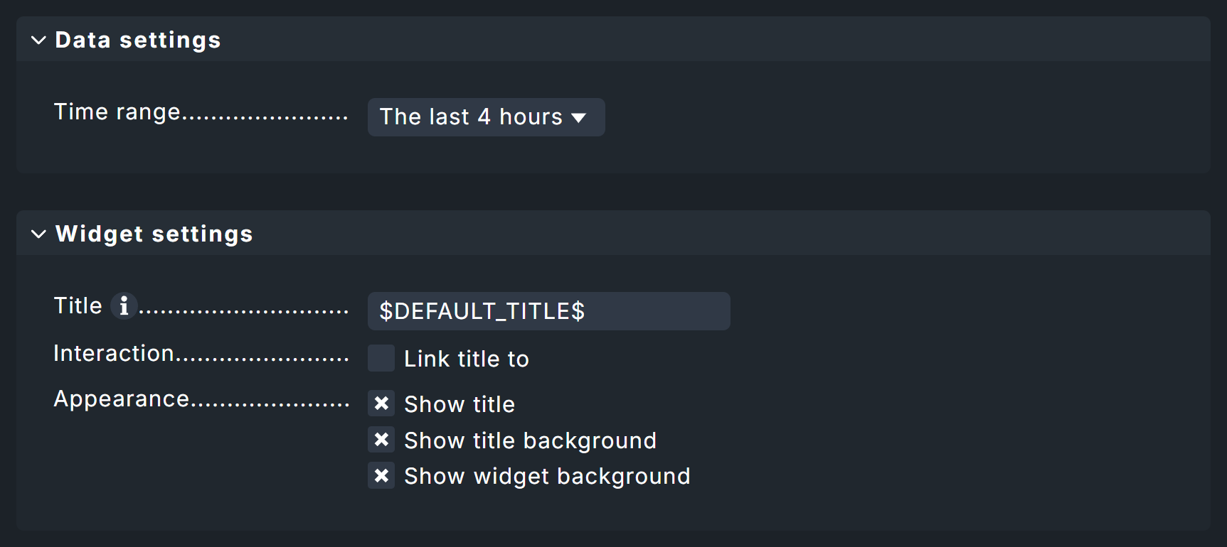
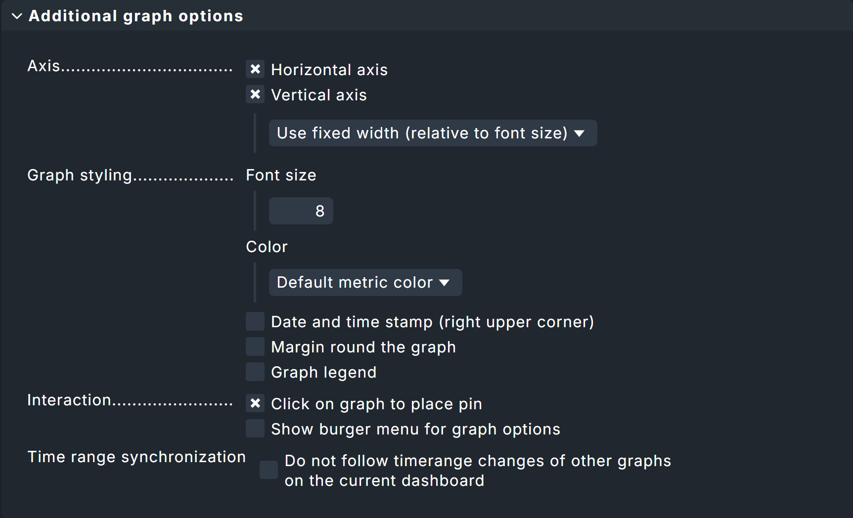
Finally, there is a graph-specific configuration that corresponds to the general graphing functions and which is, of course, entirely optional.
If you’re satisfied with the layout, you can continue by clicking Add & place widget.
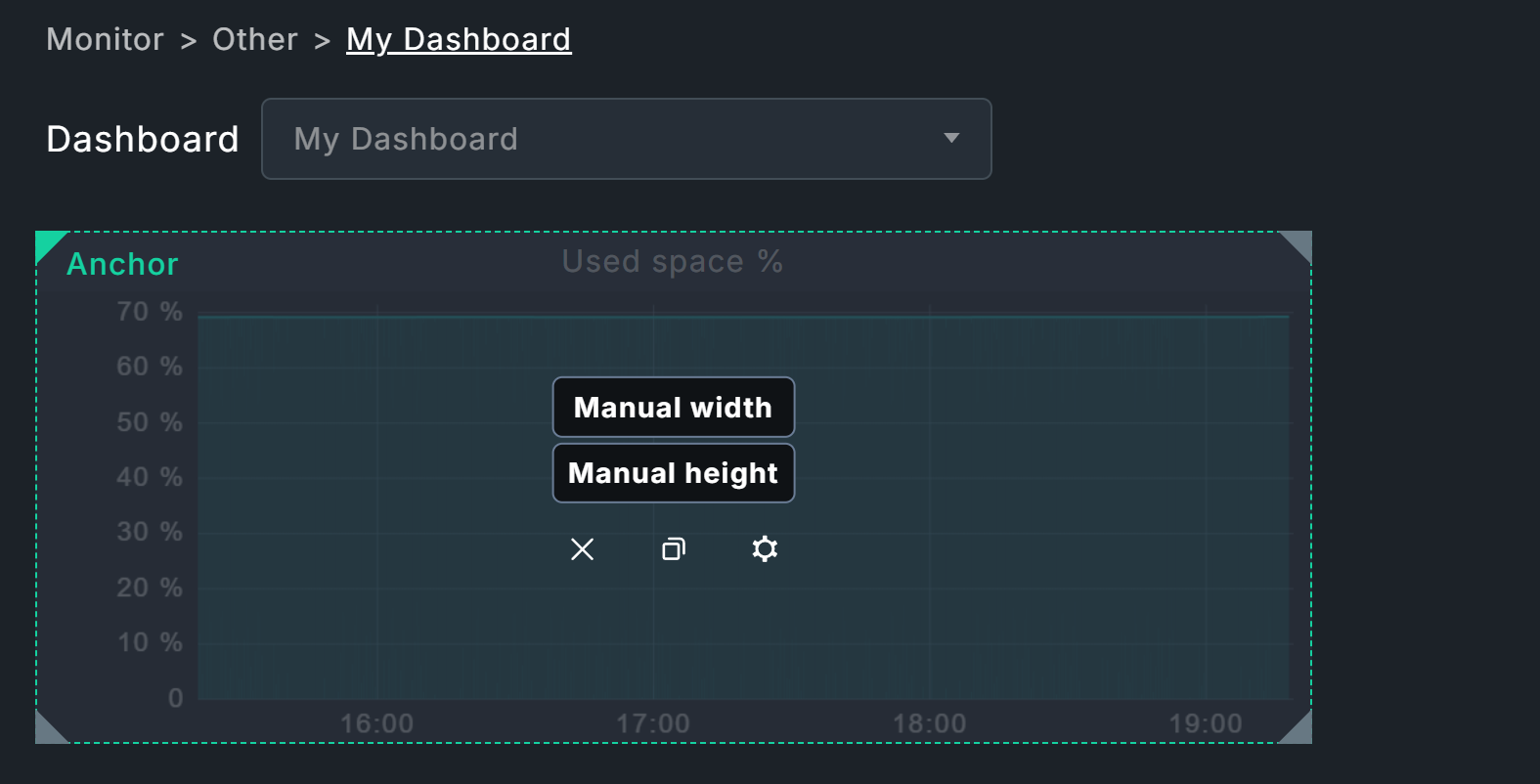
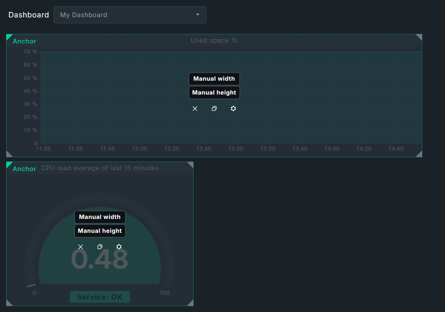
The new widget can now be positioned and scaled as described in the chapter Layout. For the example dashboard shown above, Manual height and Auto width are suitable options: You specify the desired height, and the algorithm automatically extends the widget from the anchor (top left) to the right, up to the next widget or, in this case, to the edge of the dashboard.
Adding the Gauge widget
The Gauge widget is available only in the commercial editions and displays values such as CPU usage in a style similar to a car speedometer.
The configuration is almost identical to that of the graph you have just created; again, filter by myhost and now by the CPU load service.
Once again, both values are automatically carried over into the Metric selection box.
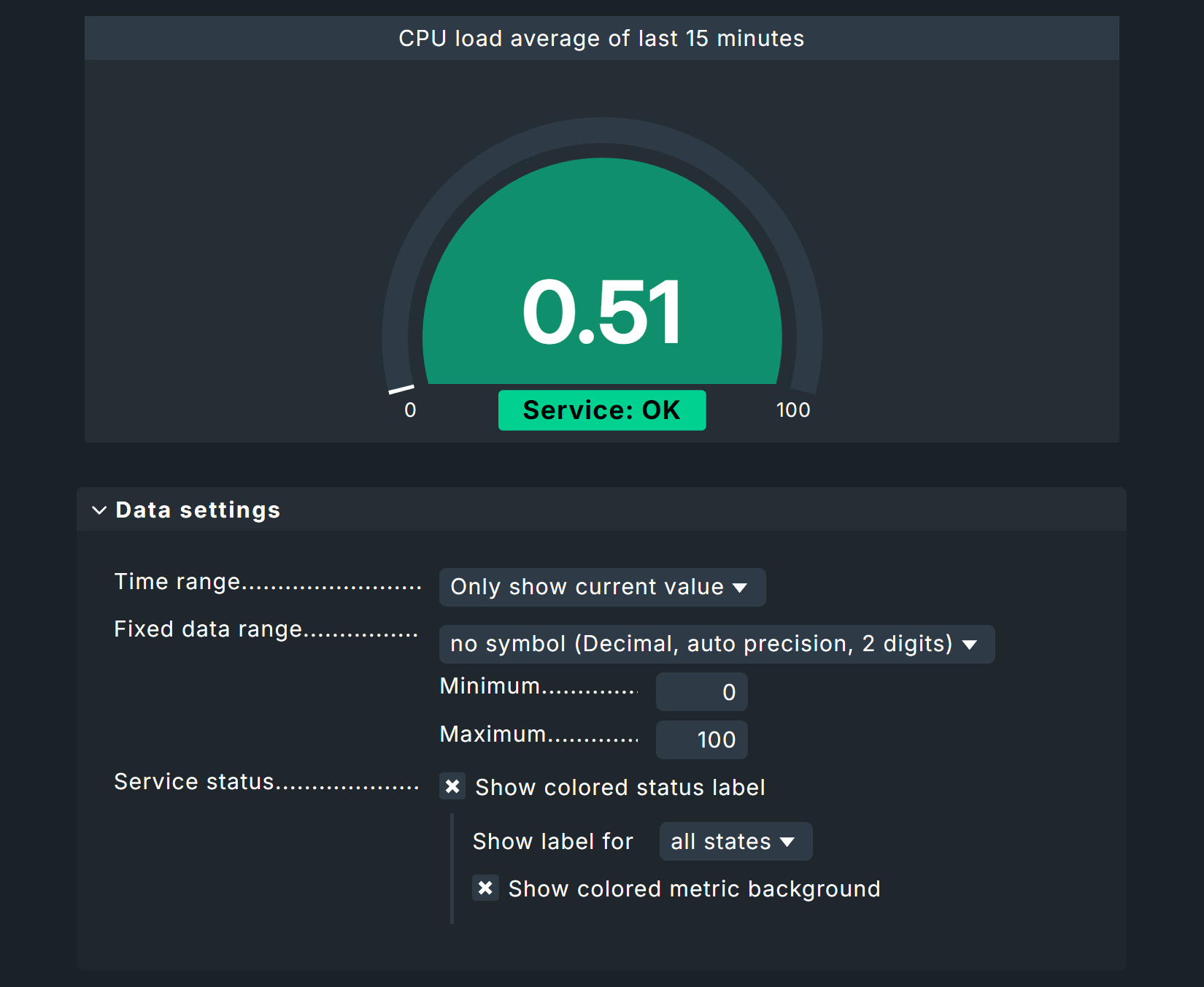
Select CPU load average of last 15 minutes as the metric.
The Gauge widget offers some interesting data settings. You’ve already learned about limiting the time range. For this type of visualization, however, it’s also useful to limit the data range — for percentage values, a range of 0 to 100 works well. However, alternatives are possible: For example, here you could enter the maximum value before the service changes from OK to CRIT to see larger fluctuations during normal operation. In our example, the Show colored status label and Show colored metric background options have also been added to attract maximum attention.
After saving, you will return to layout mode and can place the widget below the file system graph (which will initially be covered by the new widget!). Here, you can set the width and height manually. You can set the desired size by dragging the widget’s edges with the mouse. At this point, you could also set the graph widget to automatic height and simply let the placement of the new Gauge widget determine its height.
Adding an Alert Timeline widget
The third widget is the Alert Timeline — also available exclusively in the commercial editions — which displays alerts on a timeline.
This widget is intended to display data from multiple hosts and services — which is why there is no dashboard-wide pre-filtering at the top.
With this widget, it often makes sense to disable filters entirely in order to evaluate all hosts.
You can be more precise by using the Host name (regex) host filter, which you first add from the filter list on the left.
Here you can work with regular expressions as usual.
For example, to retrieve all alerts from all hosts that start with my, set the host name filter to ^my.
For our example, we want to be a bit more specific, so we’ll limit this to host names containing myhost or localhost, using the notation myhost|localhost.
Just as a reminder — regardless of which default or runtime filters are set, the widget filters take precedence.
For our example widget, the specified layout Barplot is retained.
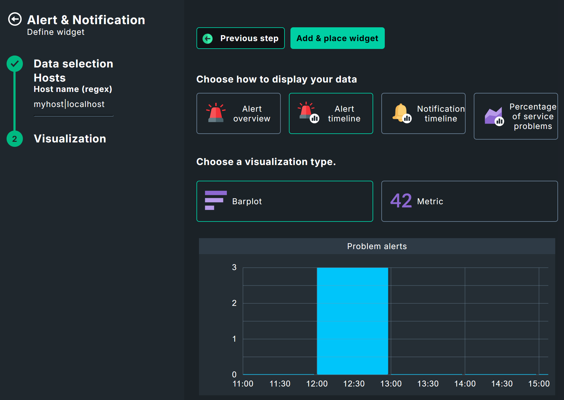
The time period, of course, depends on the size of your project; for our example, let’s use The last 35 days. A new feature here is Time resolution, which essentially determines the scale of the X-axis — in this case, whole days.

After saving, place the widget back on the dashboard. Here, it’s best to use an automatic width with a manual height to fill the row with the Gauge widget.
Adding a widget via a view
Existing views can also be used as widgets. This works via Add widget > Views > Link to existing view, but also via the views themselves. Alternatively, you can use copies of views here or create entirely new views. For our example, however, we’ll take the most elegant approach: using the views themselves.
To add the scheduled downtimes view, for example, call it up via Monitor > Overview > Scheduled downtimes. Then add this view to your dashboard via Export > Add to dashboard
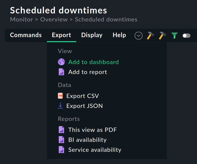
Select your dashboard.

Place the widget as the last row. Here you can now use automatic height and width to eliminate empty areas.
If you now call up the  widget properties from the layout mode, the settings already known from views are available to you, for example, to make the widget a little slimmer — after all, a click on the widget title takes you to the full scheduled downtimes view anyway.
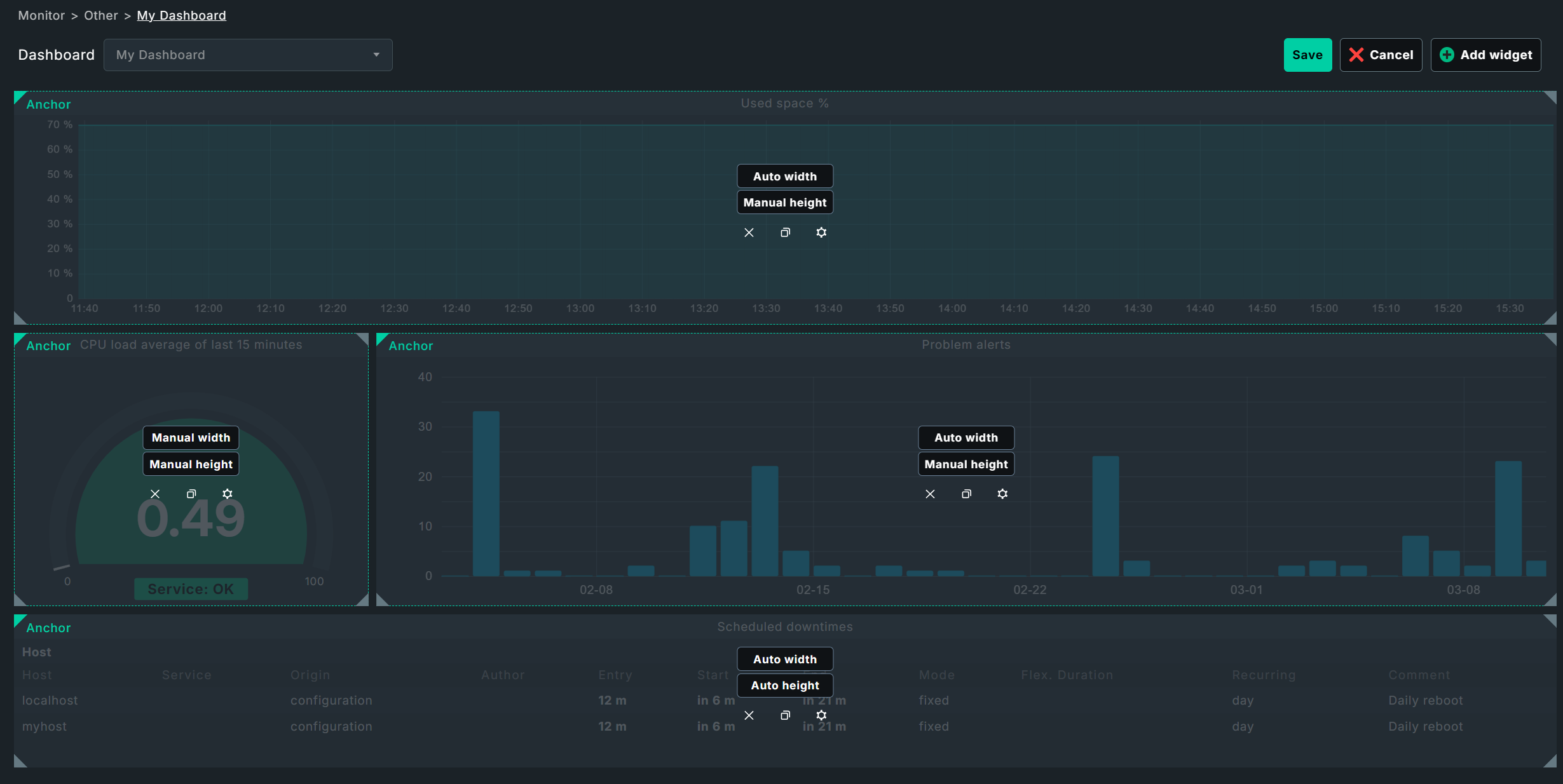
With that, your example dashboard is ready, shown here again completely in layout mode:
5. Built-in dashboards and widgets
5.1. Built-in dashboards
A list of all individually-created and built-in dashboards can be found via Customize > Visualization > Dashboards.
For your own variants, you can call up the properties via  and the layout mode via
  .
You cannot edit the factory-set dashboards directly from the list, but you can clone them via
.
You cannot edit the factory-set dashboards directly from the list, but you can clone them via  and then customize the clone.
|
Not all dashboards are integrated in all editions of Checkmk. The cloud vendor specific dashboards can only be found in Checkmk Ultimate, Checkmk Community is limited to some basic dashboards. |
Here is an excerpt of the built-in dashboards:
| Name/ID | Monitor menu item | Content |
|---|---|---|
|
Cloud > AWS EC2 instances |
Overview of EC2 instances |
|
Cloud > Azure VM instances |
Overview of Azure VMs |
|
System > Checkmk dashboard |
Checkmk servers and sites |
|
Cloud > GCP GCE instances |
Overview of GCP VMs |
|
Applications > Kubernetes |
Overview of clusters, resources, nodes etc. |
|
Overview > Main dashboard |
Main View |
|
Network statistics > Alerts |
Alerts in ntopng |
|
Problems > Problems dashboard |
Problems and statistics from all hosts and services. The Problems dashboard is the Main dashboard in Checkmk Community. |
|
Problems > Host & service problems |
Problems for all hosts and services |
|
- |
Overview of a site |
5.2. Widgets
Here you will first see an overview of all widgets, then we will show you a few special features that were not covered in the example dashboard above.
| Category | Name | Checkmk Community | Function |
|---|---|---|---|
Views |
View |
yes |
Regular views as widgets |
Custom graph |
Custom graph |
no |
Manually created free-form graphs |
HW/SW Inventory |
HW/SW Inventory of host |
no |
Data from the inventory |
Events |
Event statistics |
yes |
Overall event status statistics |
Metrics & graphs |
Single metric graph |
no |
Graph for individual metrics over time |
Performance graph |
yes |
Predefined performance graphs for individual hosts/services |
|
Combined graph |
no |
Graphs with multiple metrics |
|
Scatterplot |
no |
Metrics from various hosts/services as a scatter plot |
|
Barplot |
no |
Bar chart for individual services |
|
Gauge |
no |
Single metric as a gauge |
|
Single |
no |
Single metric as a number |
|
Top list |
no |
Ranking of a single metric across multiple hosts/services |
|
Host & site overview |
Host state |
no |
Status of a single host |
Host state summary |
no |
Summary of individual statuses |
|
Host statistics |
yes |
Overall statistics on host status |
|
Site overview |
no |
Hosts/sites as status hexagons |
|
Service overview |
Service state |
no |
Status of an individual service |
Service state summary |
no |
Summary of individual statuses |
|
Service statistics |
yes |
Overall statistics on service status |
|
Alerts & notifications |
Alert overview |
no |
Hosts as alert hexagons |
Alert timeline |
no |
Alerts over a timeline |
|
Notification timeline |
no |
Notifications over a timeline |
|
Percentage of service problems |
no |
Percentage of service problems via timeline |
|
Ntop (if available) |
Alerts |
no |
Alerts in ntopng |
Flows |
no |
Data flows in ntopng |
|
Top talkers |
no |
Hosts in ntopng generating the most network traffic |
|
Other elements |
Embed URL |
yes |
Internal/external URLs |
Static text |
yes |
Static text for notes |
|
Sidebar widget |
yes |
Any sidebar widgets |
|
User messages |
yes |
User notifications |
How exactly you design the graphs in the graphing widgets is a bit more complex and is explained in detail in the graphing article.
A special role is played by the Custom URL widget. In theory, you can integrate external websites or resources by simply specifying an address — in practice, this often fails due to the security measures used by the operators and browsers. However, this does work with Checkmk’s own resources, for example other dashboards. You could, for instance, link several host-specific dashboards to one big overview. What you can also integrate — with a little experimentation — are internal resources from the Checkmk server; for example, any kind of web application, be it a wiki or a small chat program.
The Site overview widget has two functions: In the layout explanations above, you see it as an overview of hosts — by default on a normal, single Checkmk site. In distributed monitoring, on the other hand, this widget shows an overview of the namesake sites.
The widget Static text can do a little more than you might expect: it is suitable for notes and simple labels, but it can also be used to link to other dashboards or other Checkmk components, as you can see in the following example of a top-down dashboard.
6. Dashboard examples
6.1. Top-down dashboards
So now you are familiar with all of the available widgets and finished dashboards, know where to access their configurations and layout options, and how to assemble a complete dashboard. However, dashboards do not necessarily have to stand on their own, but can also build on each other — for example, to navigate from a large overview to the smallest detail.
Basically, many dashboards already work exactly like this: The Host statistics visualizes the host states and a click on one of the states redirects to a view that lists the associated hosts — and from there it goes on to the individual services of a single host.
For your own dashboards, you can also create links to other dashboards by linking the title bar of widgets via Link of Title in the widget options. Let’s take a concrete example: Here you see a dashboard that shows information on the CPU, RAM and file systems of some hosts.
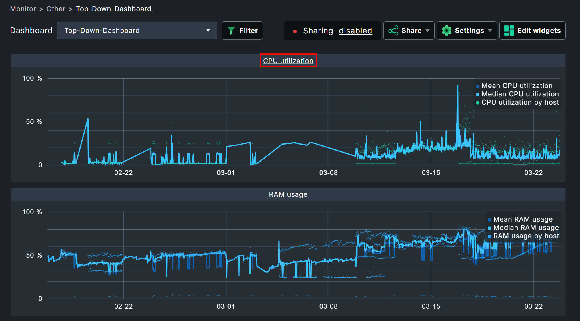
In this example the title of the CPU graph links to another dashboard that visualizes the CPU information for each host individually. In this dashboard, there is again a link at the top back to the overview, simply achieved using a Static text widget.

With such cross-links, you can develop complex research tools via dashboards. By the way, you are not limited to the title bar — you can certainly use HTML code as static text and thus incorporate entire navigations. Consider, for instance, distributed monitoring and paths such as General overview > Instance overview > Host overview > Container overview > Services > Problems.
7. Troubleshooting
7.1. Missing filters
It may occur that you will see only the following warning with a yellow background for a widget:
Enter runtime filter to load data
In this situation, the widget should be displaying information for only a single host and/or service — but for which no filter has been set. To fix this, you can either use the filters in the dashboard view or in the widget configuration.
7.2. Empty widgets
There can be several reasons for completely empty widgets without error messages. Usually it is a misconfiguration of the widget.
Example: You create a widget for CPU load with the metric and the filtered service CPU load. Later you change the filter of the service description to something like Check_MK Discovery, but leave the selected metric at CPU load. When creating a widget, this cannot happen to you, because after the filter on the CPU load, the selection of an unsuitable metric is impossible — when reconfiguring widgets, however, the originally selected metric is retained.
The solution to this problem is trivial — alter the service filter and the selected metric in the widget configuration. Of course, this also applies to all other widget variants.